IDENTIDAD / COMUNICACIÓN / SOCIAL MEDIA
SEP 2019 / ENE 2020

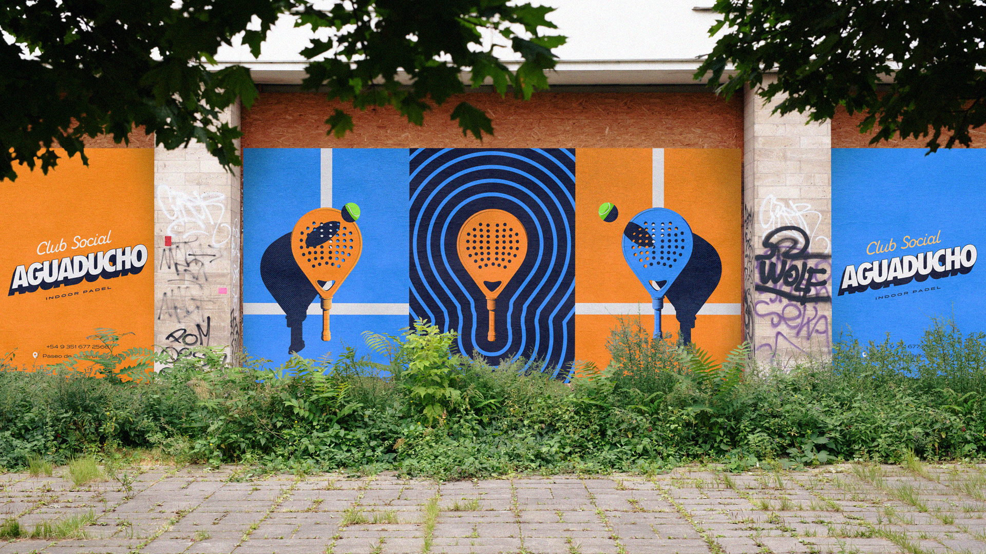
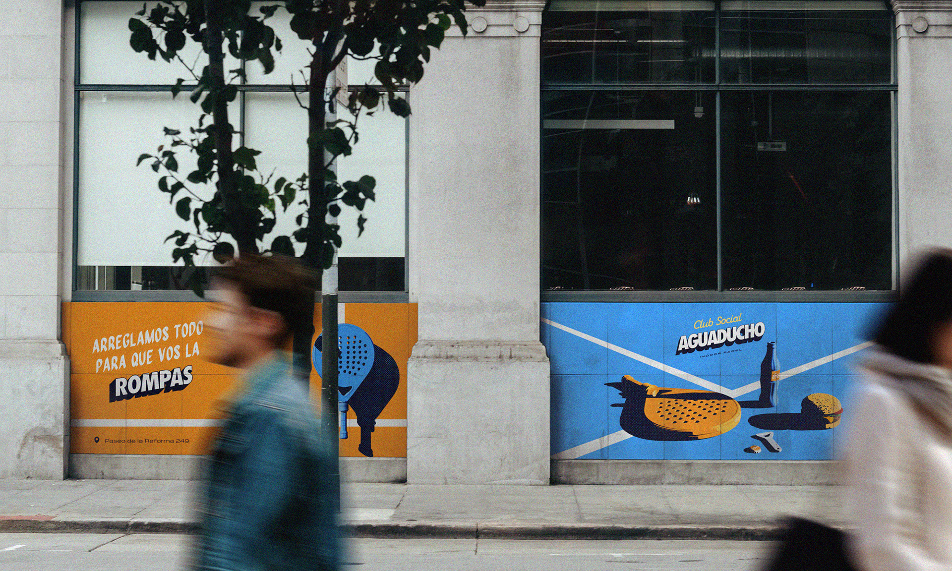
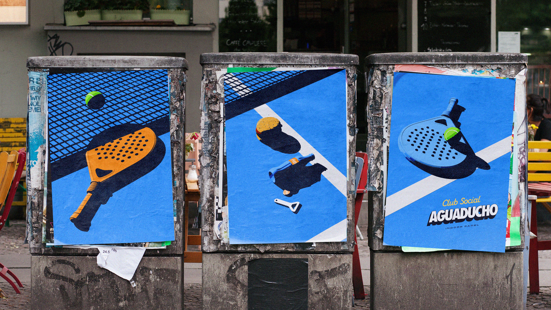
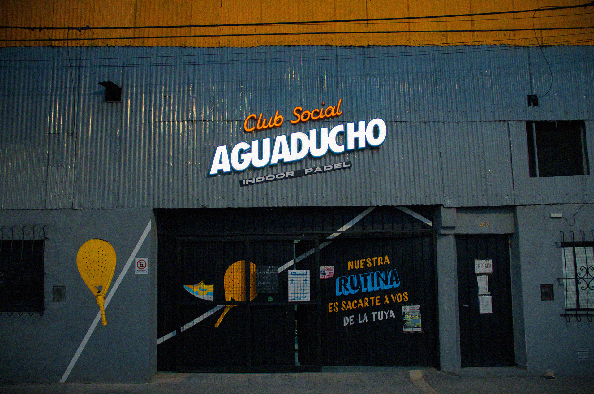
Club Social Aguaducho.
CÓRDOBA CAPITAL, ARGENTINA.

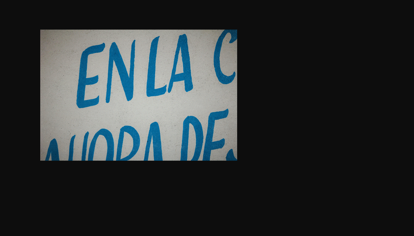
En el Siglo 19, el aguaducho era un riacho que se formaba cuando había grandes lluvias. Debido a que era muy frecuente que se desbordara, fue causante de muchas inundaciones. Hasta que se decidió taparlo y se formó una calle en forma de pasaje.
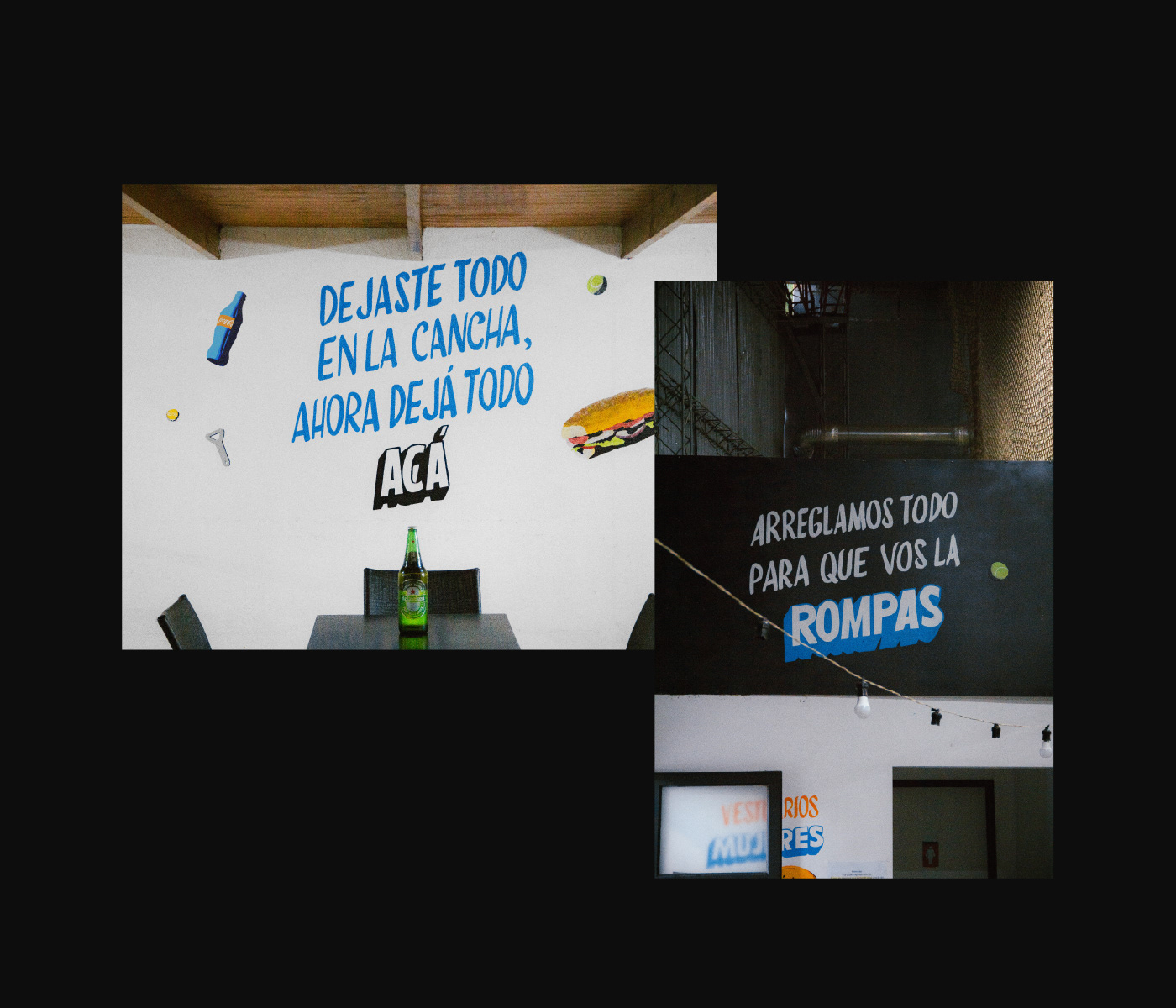
Hoy, el aguaducho se forma cuando hay grandes juntadas, y cuando se desborda, en vez de causar inundaciones, causa muchas alegrías. Y a eso, nadie lo puede tapar.


Otros proyectos

LOGOS & MARKS Y/23
LA LIBERTAD (TNC) & BACILE STUDIO LOGOS & MARKS [2023]
LOGOFOLIO 2018/2020
LA LIBERTAD TNC & BACILE LOGOFOLIO 2018/2020: Selva, Tundra, AlquiloParticular, Peita, Grand Tour Catalunya, De La Rosa Tulum, Cow Co., Arquido, Run Altas Cumbres, Festival de Arte Joven, Reversible Estudio, 25 Watts, Bacile Studio, Aguaducho, Sincero, Lykke, Mental, Pangea.
FUEGOS
Fuegos® de San Antonio es un pequeño restaurante ubicado en Villa Carlos Paz, especializado en alimentos autóctonos a la parrilla. Desde su concepción, buscamos destacar la importancia del fuego en la propuesta gráfica y conceptual de la marca, generando una historia visual y discursiva en torno a este elemento fundamental para este negocio. Trabajamos en todo el proceso de branding, desarrollando también la arquigrafía del lugar, la comunicación en redes sociales y piezas gráficas diversas como carteles, menú, neones, señalética, etc.
MERCADO SAN ANTONIO®
San Antonio es un mercado ubicado en Villa Carlos Paz, Córdoba, Argentina.
 Una propuesta muy particular, que no solamente ofrece alimentos frescos, locales y ricos, sino que además, promueve experiencias distintas para sus visitantes, y los invita a form…
MISC.™ APPAREL BRANDING
En lo diverso está la riqueza. No solamente en los diferentes gustos musicales que tenés con tus amigxs, o en la discrepancia política con algúnx familiar lejanx. La riqueza de la que hablamos, la encontrás también en una mecha de color rosado. En unas medias de pares distintos. En un tatuaje. En la defensa de una postura. En un tweet. O en un corte de pelo distinto. Abrirse hacia lo imprevisto amplía los horizontes. Los horizontes estéticos, culturales, sociales, pero sobre todo mentales. Lo diverso está en esa libertad de poder ser y hacer cualquier cosa. Siempre que esa cosa, sea lo que uno quiere. La riqueza de la que hablamos florece cuando somos nosotrxs mismxs. Cuando entendemos que lejos de separarnos, esa diversidad nos une.
PANGEA · Branding
Pangea es una marca de indumentaria y billeteras ecológicas de Córdoba, Argentina. Que a través del concepto propuesto en este proyecto, no busca marcar diferencias, sino encontrar similitudes entre las personas del mundo. Unidas por sus gustos a la hora de vestir, por sus ideales, por sus creencias... El proyecto, consistió en la creación del concepto comunicacional para la marca, y en todo el desarrollo de branding.
KNITTED CITY™
Knitted City is an international CG Studio that offers CG stills, animation, interactive experiences & art direction services. And this project consisted of developing the branding for the studio. The starting point for the brand's concept and aesthetics, was the idea of Knitted City as an open and great place to work. It’s related to the brand’s name, which tells the story of a united community of people from all over the world. We tried to represent the idea of a great ecosystem of work that attracts talents worldwide. The work included the visual identity, as well as its communication concept, copywriting, social media and website.
LOGOS & MARKS Y/22
LA LIBERTAD TNC & BACILE STUDIO LOGOS & MARKS [2022] SWVL, TOKEN CARS, KNITTED CITY, SERRA, LOVELY PRODUCTIONS, SUPERFILIATE, LUV&LIFE, GO GLOBAL, LA MARY, DJUCE, URBO, MANSALVA, FIASCO, UNBOX, CREDO, MISIONES, BA:NU, MERCADO SAN ANTONIO, MEMBAH.
BA:NU SKINCARE
Ba:nu is a beauty brand that focuses on falling in love with our skin. The brand narrative centers around the concept of pure love. And it proposes a sincere mutual care agreement between people and their bodies. This project consisted of developing the whole branding. The main idea behind the brand's concept and aesthetics was the softness and purity related to the skin and how each one takes care of it with love and tenderness. The work included the visual identity, as well as its communication concept, copywriting, social media, and packaging.
FIASCO©
FIASCO© is a designer clothing brand, reborn from the ashes of branding projects, rejected by different clients. It is the reincarnation of many brands that did not see the light of day, in one that did. They are unique, unrepeatable and artistic t-shirt…