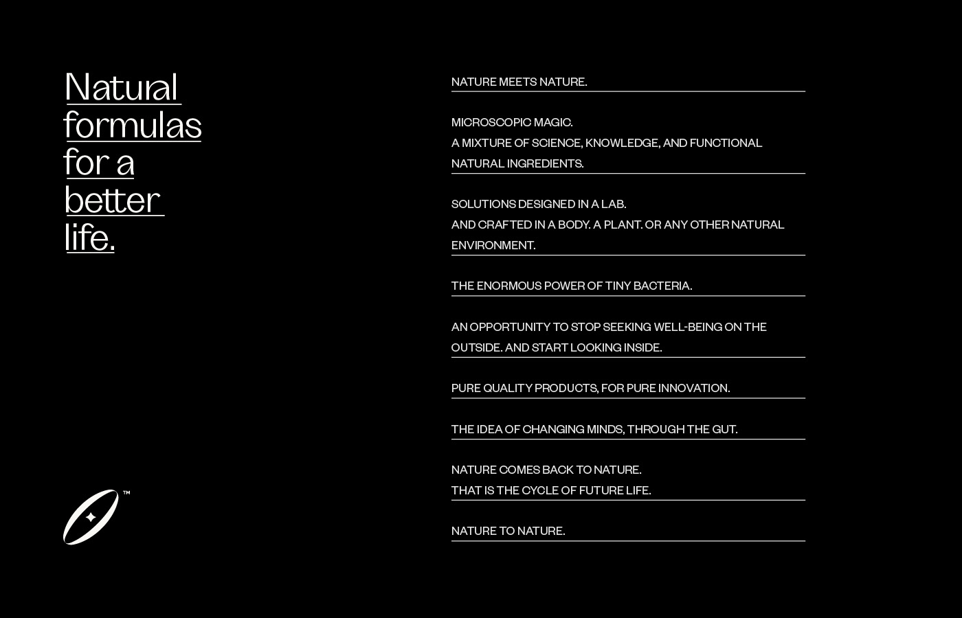
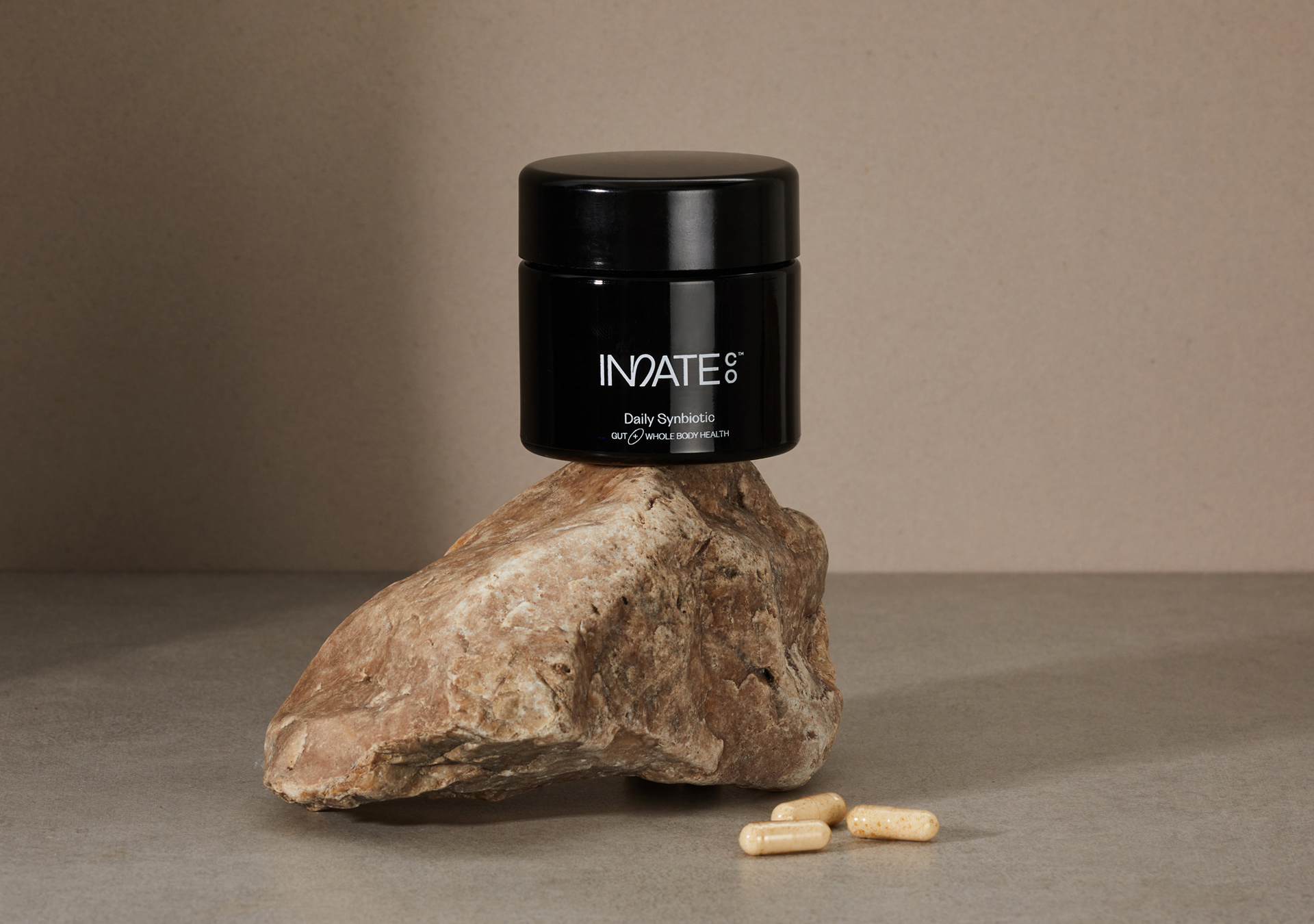
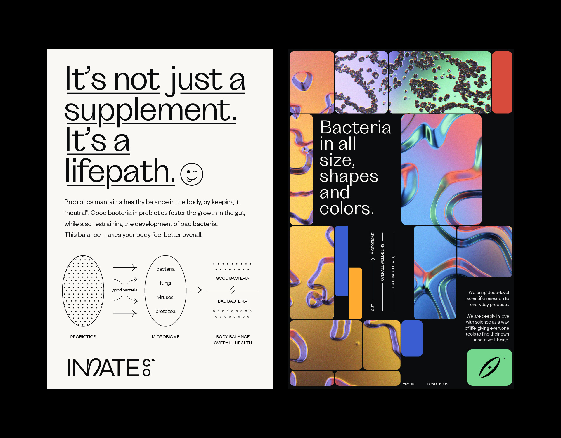
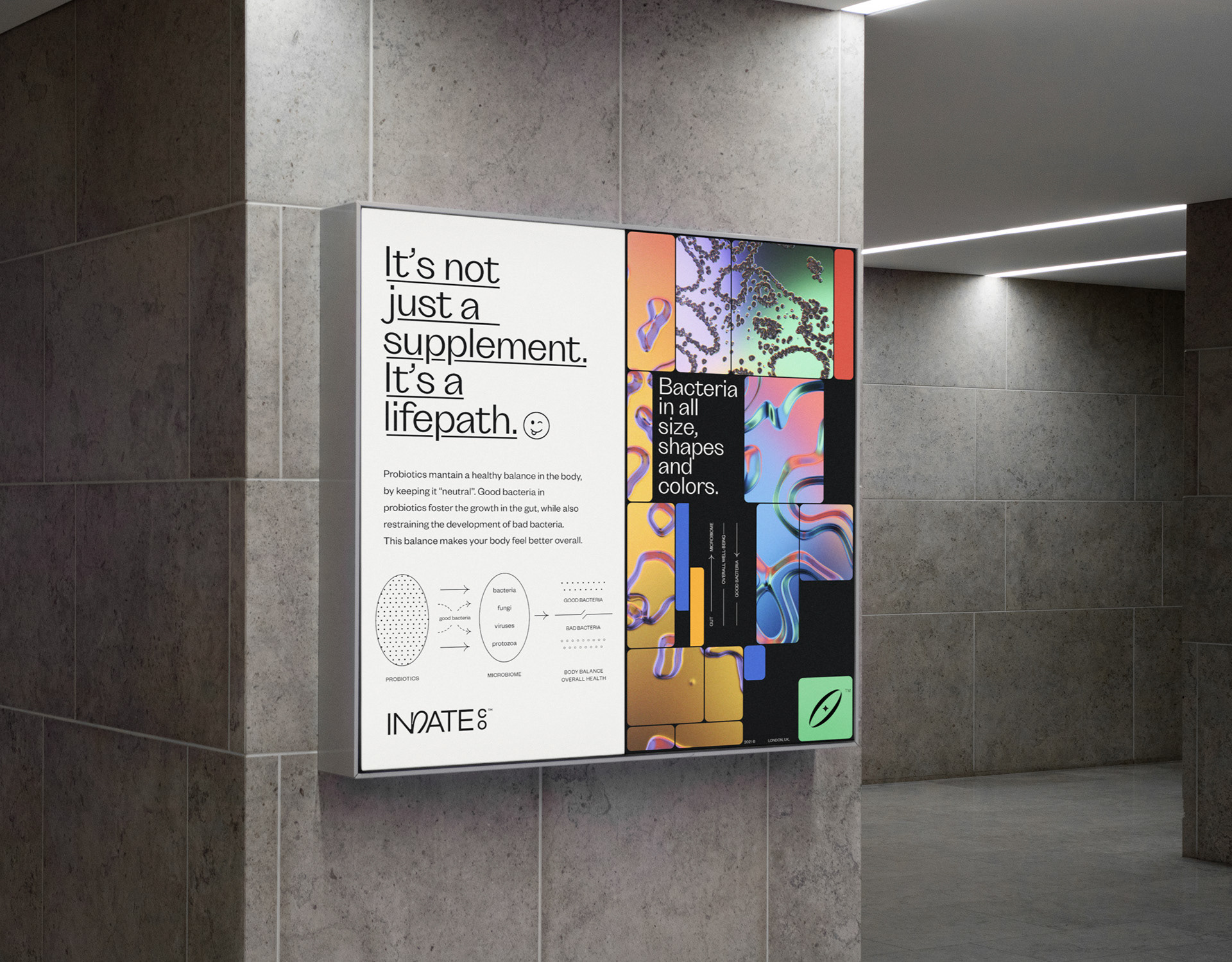
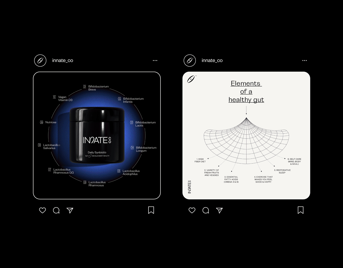
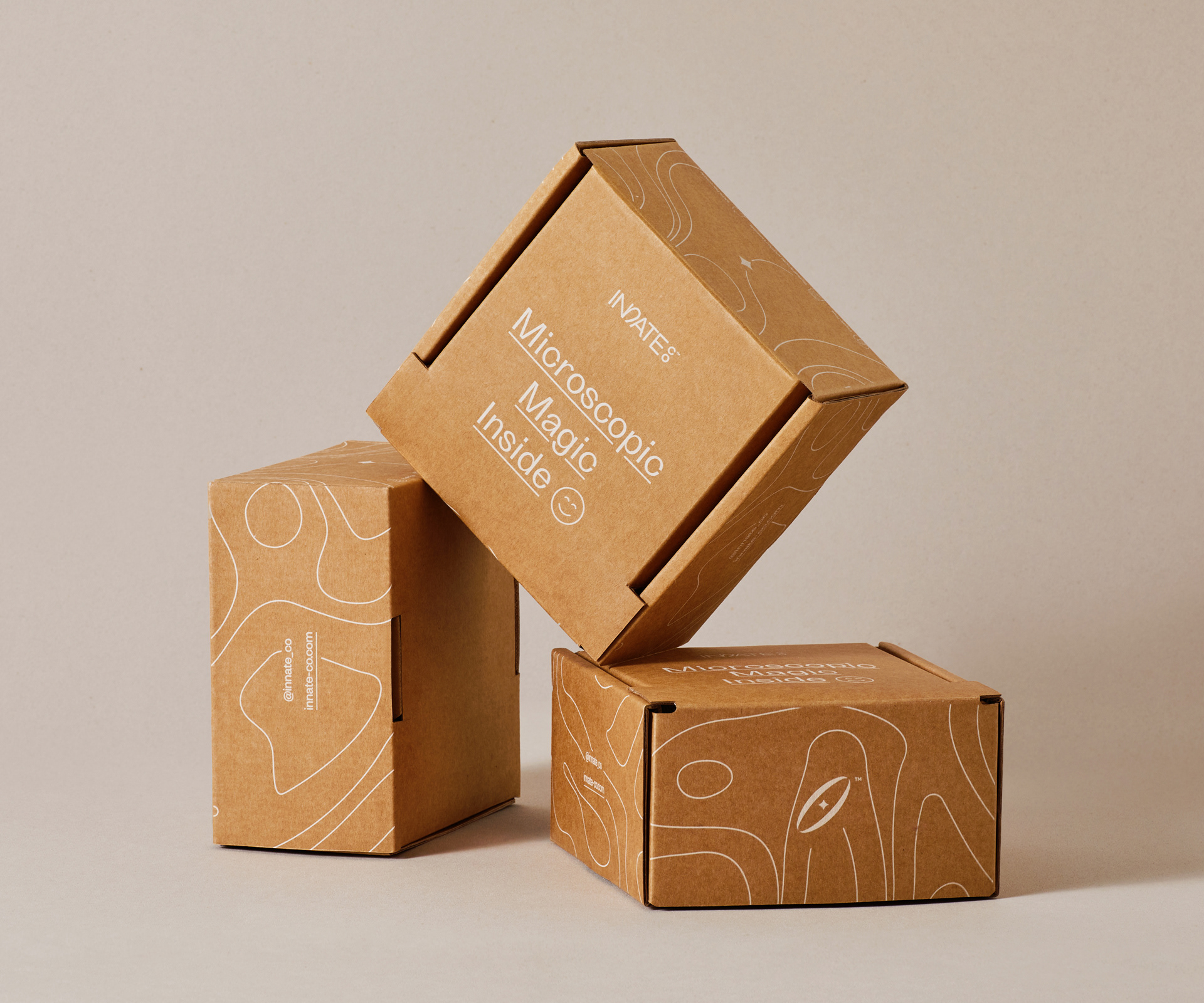
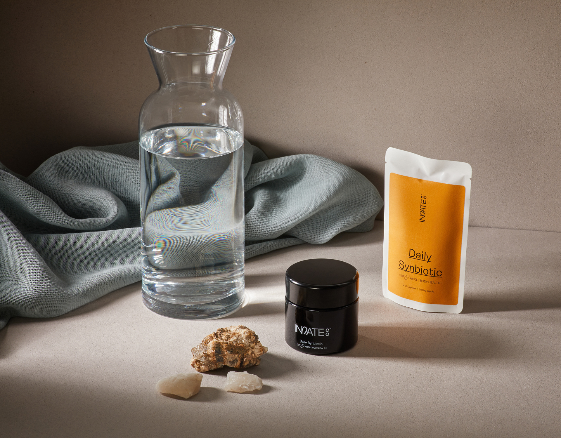
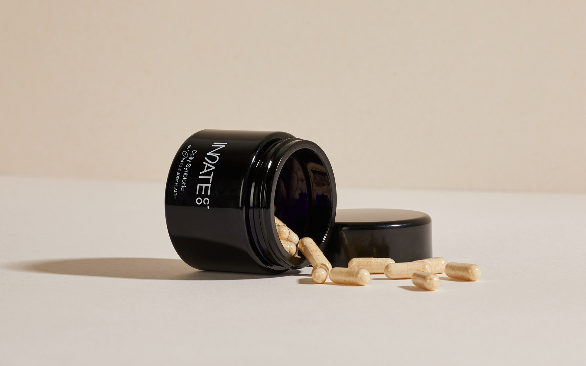
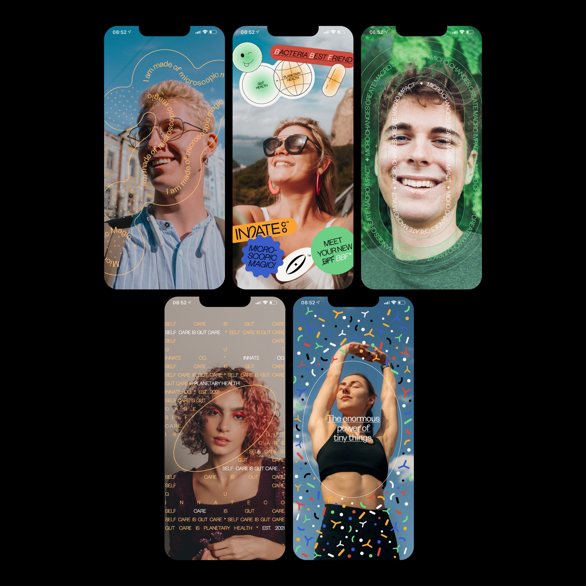
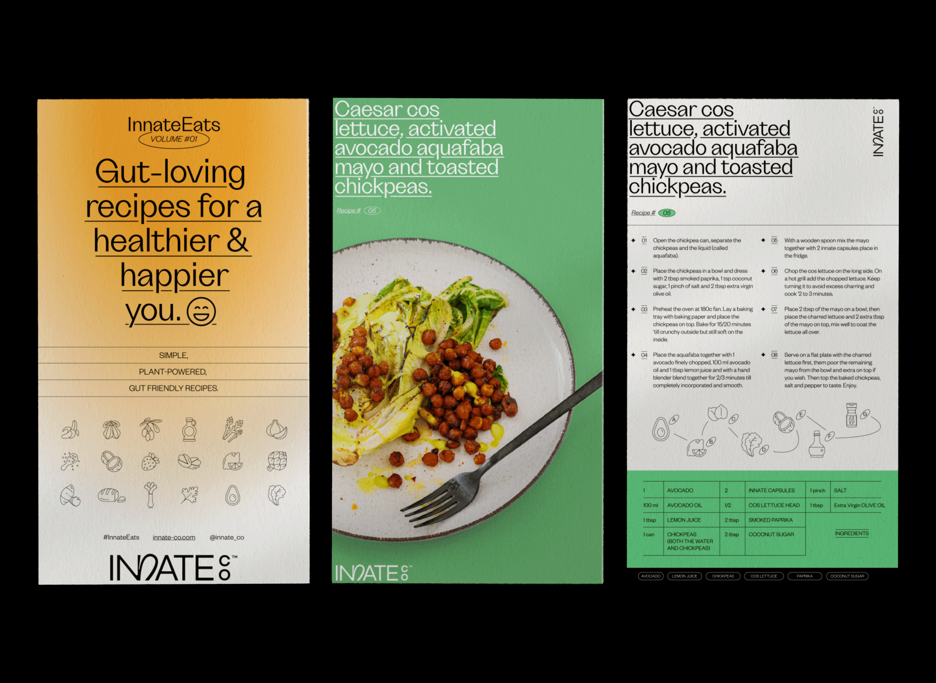
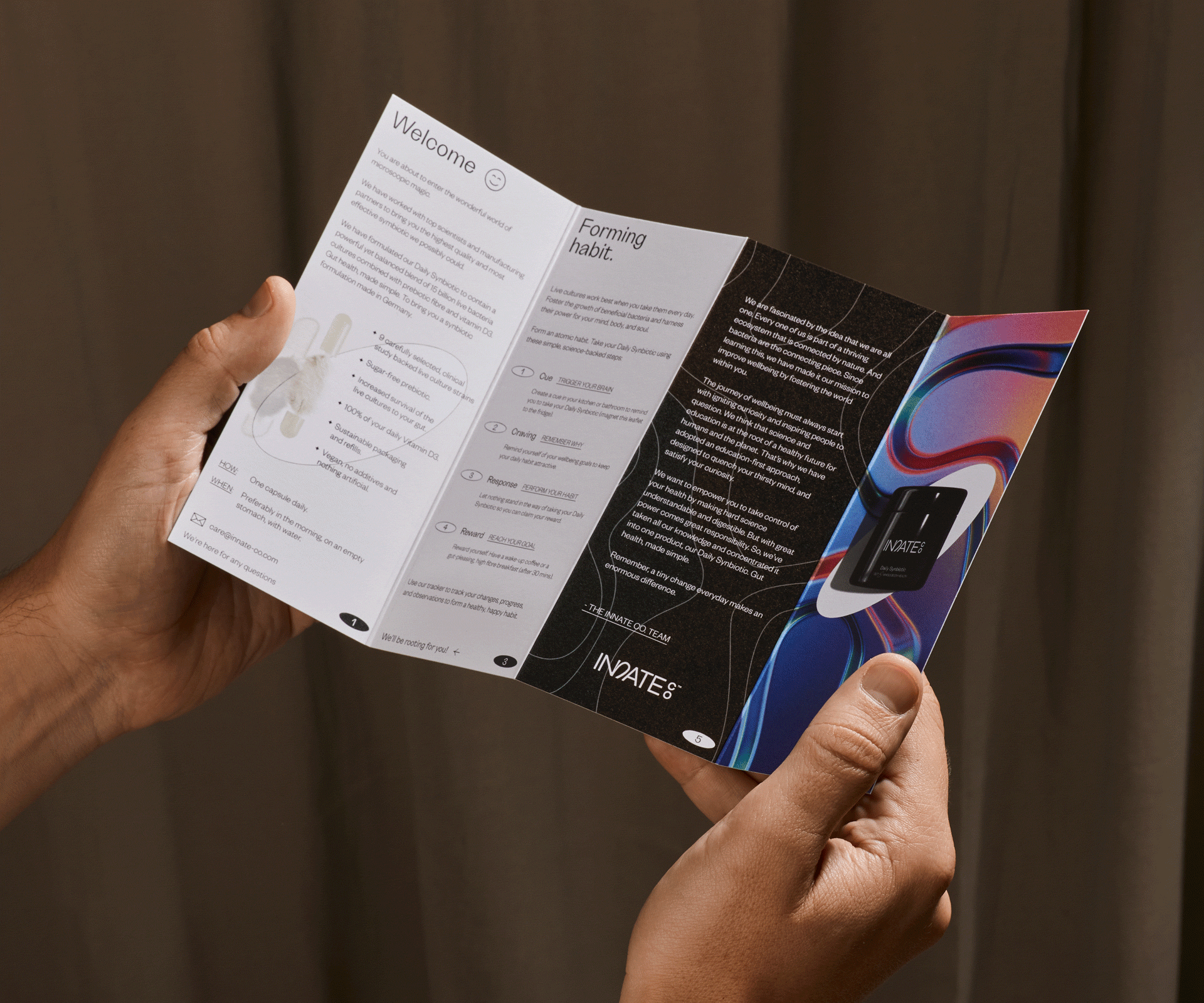
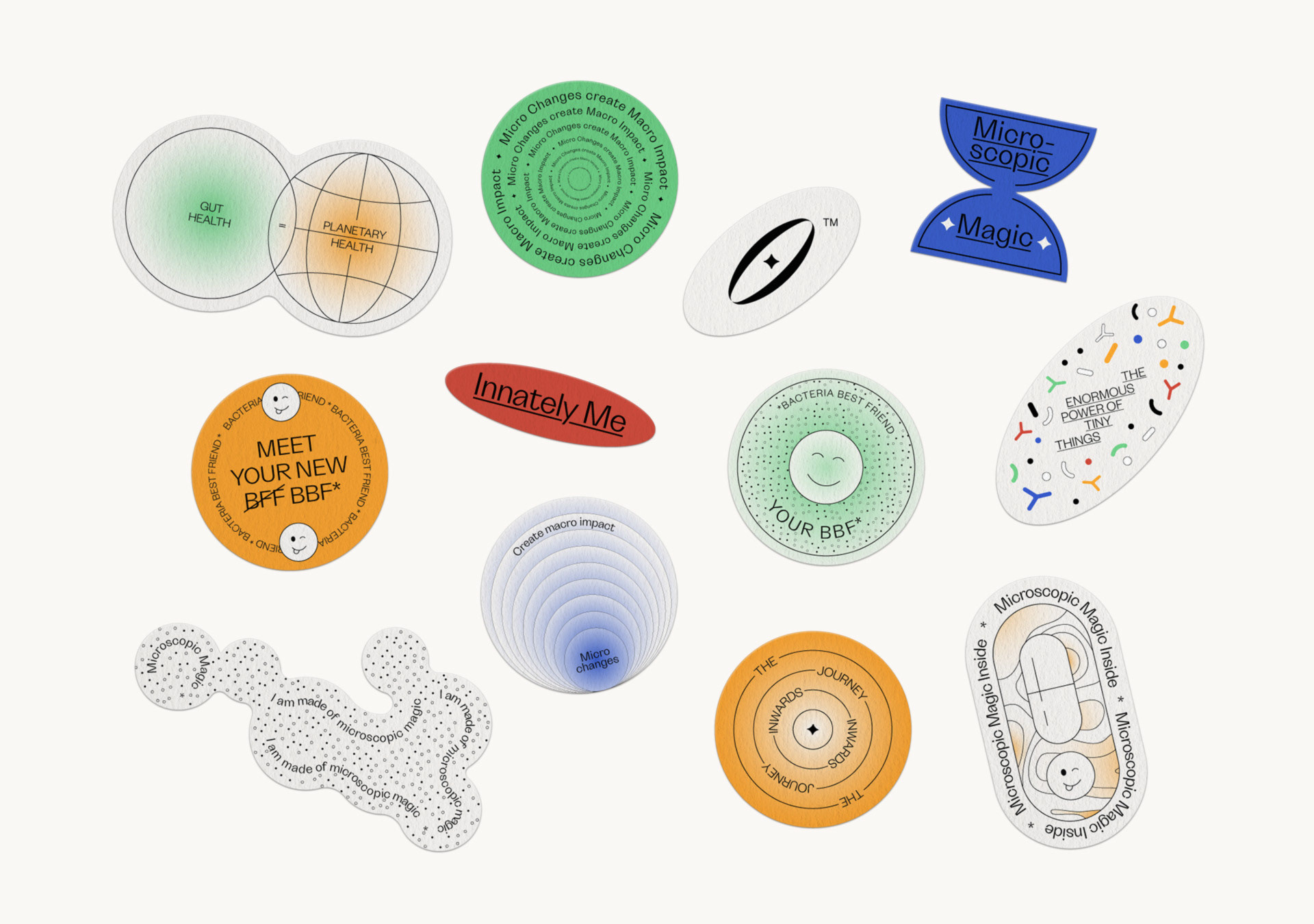
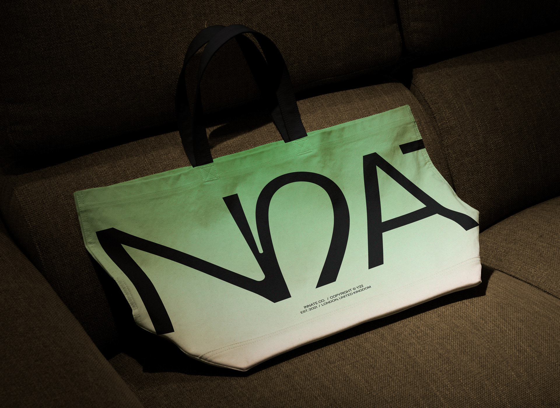
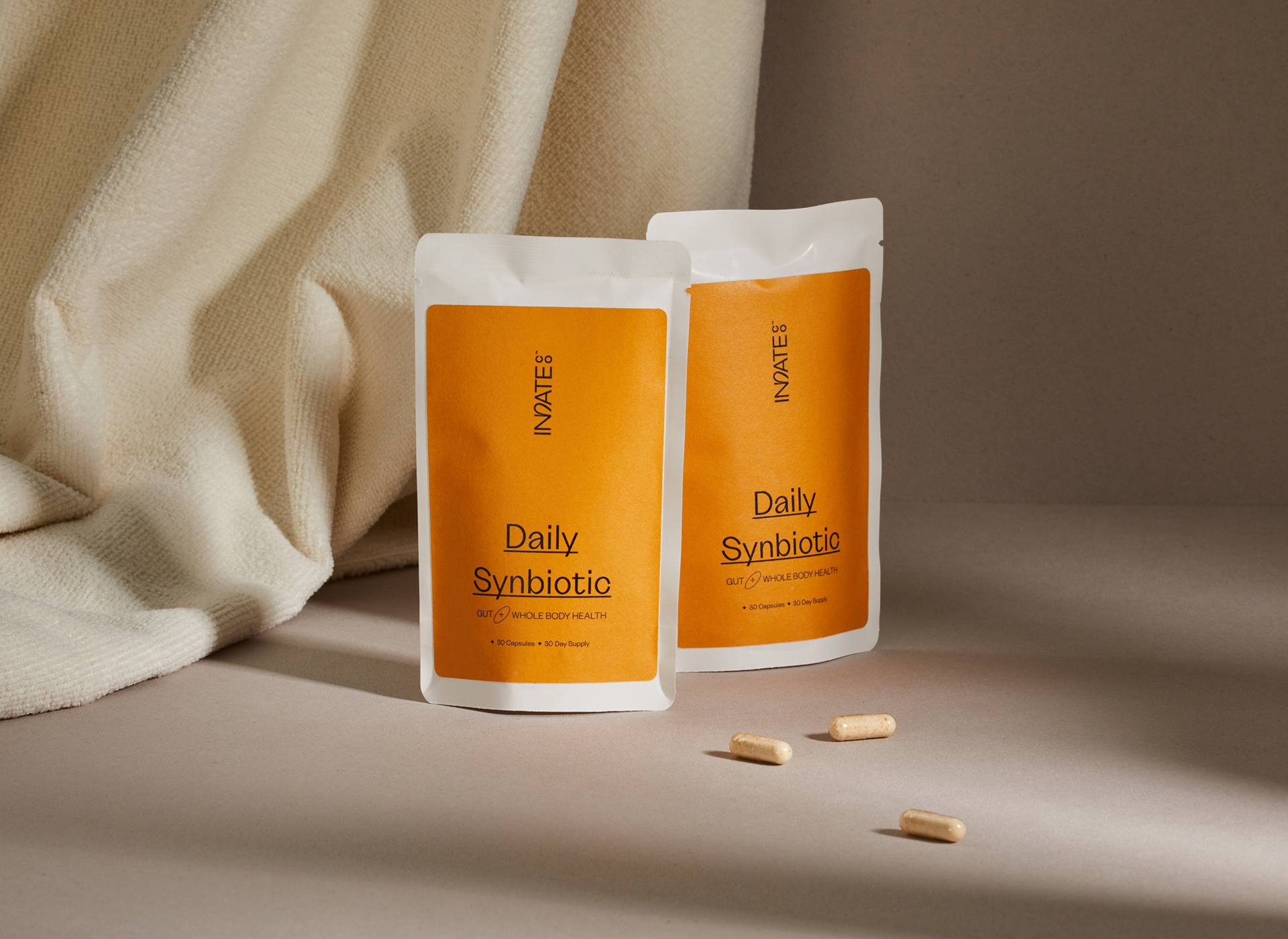
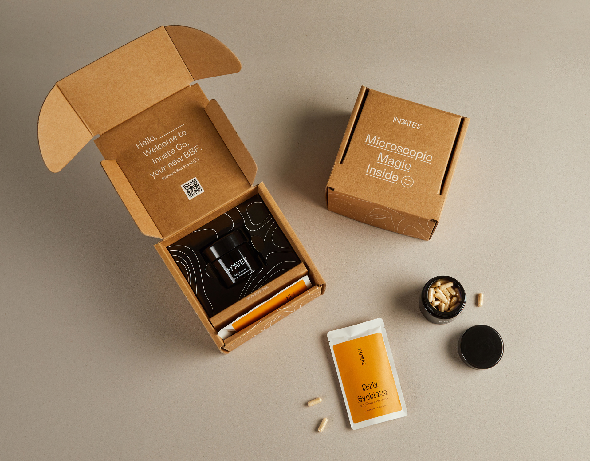
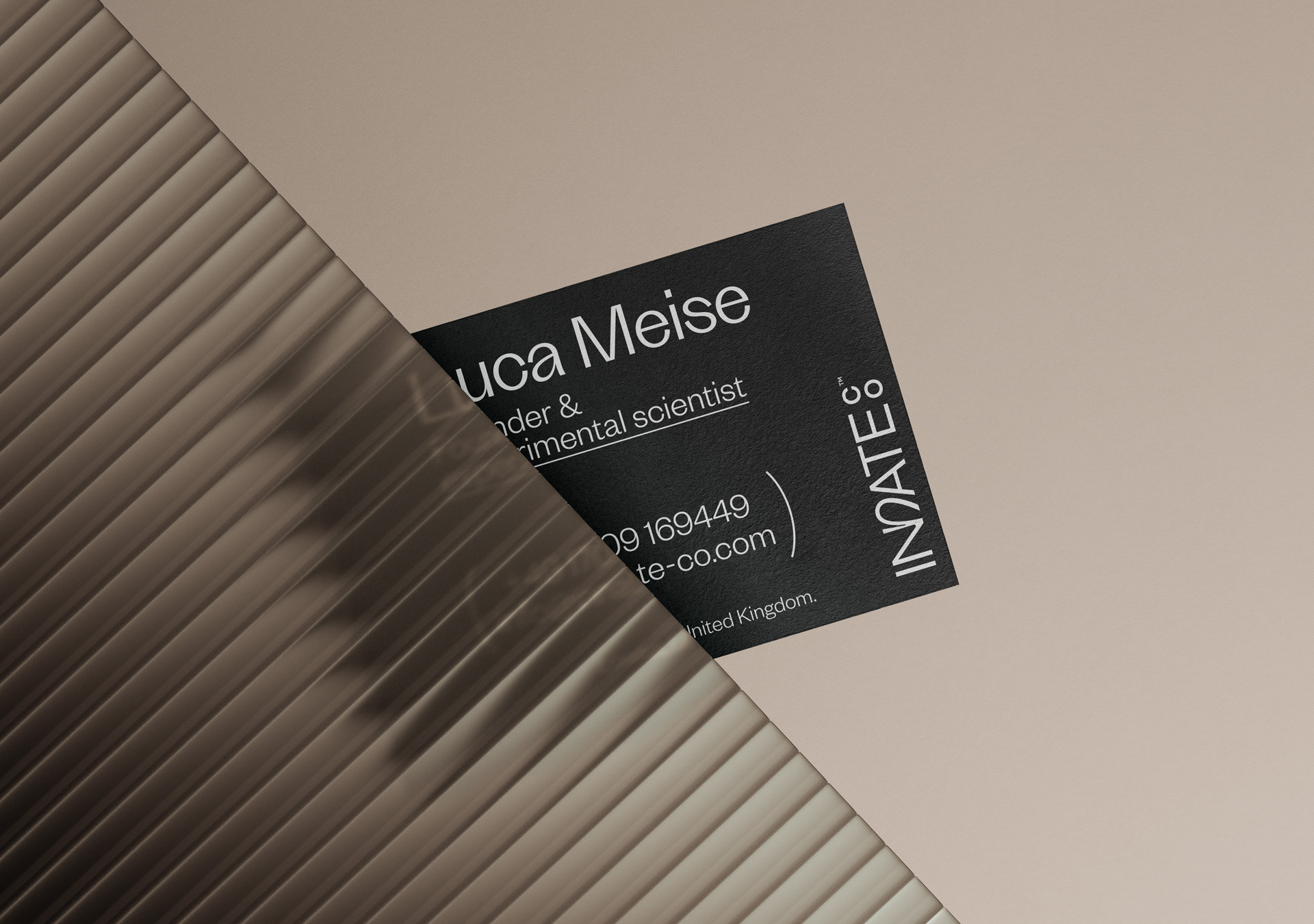
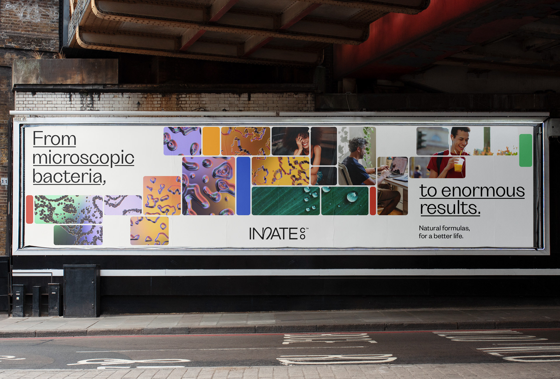
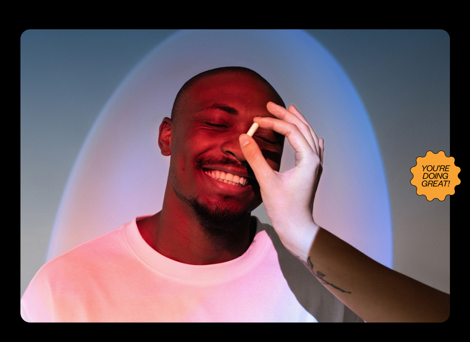
INNATE CO.
The starting point for this project was to let go of artificial ingredients and embrace the benefits of natural ones. It sought to show that there is also science and accuracy in organic components. This is how Innate Co. is born. A brand that produces natural, science-based natural supplements, promoting a conscious and healthy lifestyle. We were asked to develop the visual identity and communication of the brand. We worked on the complete branding project, from its conceptualization to its visual development.

Otros proyectos
LOGOFOLIO/2021
LA LIBERTAD TNC & BACILE LOGOFOLIO [2021]
Hito, Not Your Mona, Far Far, Manifiesto, Utopía Colors, Dit, Zür, Calandria Norte, Gratitud, A Mar, Calandria Mall, Casablanca, Filadd, Innate, Framex, CoAgro, Caseland, Mercado San Antonio, Misc.
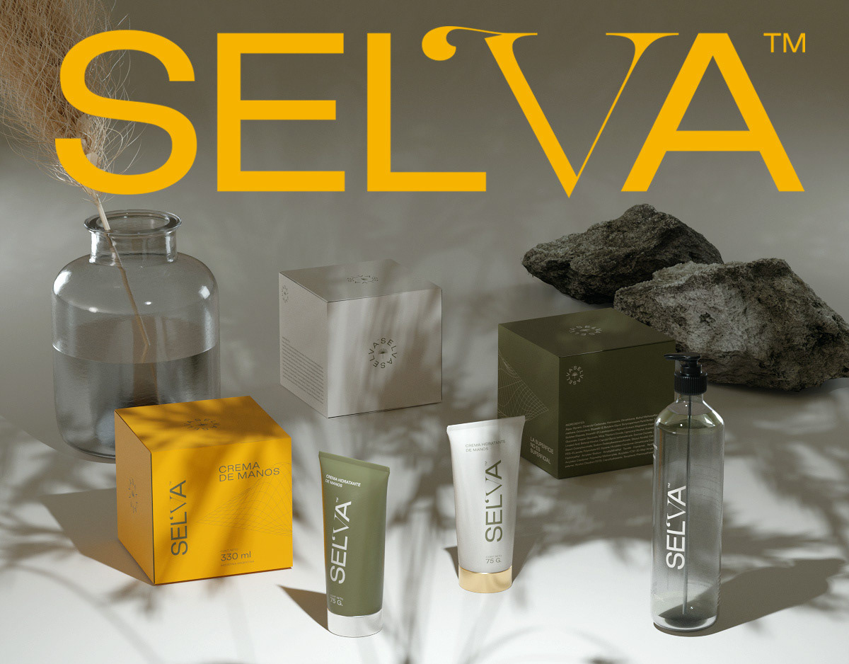
SELVA COSMETICS · Branding
SELVA es un centro de Dermocosmética & Beauty ubicado en la provincia de Córdoba.
La marca propone un abordaje integral en el cuidado del cuerpo, entendiendo que la relación con el mismo tiene conexiones profundas.
Como complemento a sus servicios ofrece productos propios como cremas, jabones, lociones, entre otras.
El desarrollo abarcó la conceptualización, el branding y el diseño de packaging.
BACILE * PERSONAL BRANDING
Bacile is my surname as well as my personal brand name, for which I started the process of creating a visual identity in 2020.
Long overdue, I thought my graphic image needed a more professional and consistent refresh, and the main concept appears as a representation of my own skillset: graphic design and animation combined to create compelling and hypnotic communication.
The concept responds to the visuals in their purest form. No fancy words, no long manifesto, no unbelievable promises. Just the graphics, open to the viewer's own conclusions.
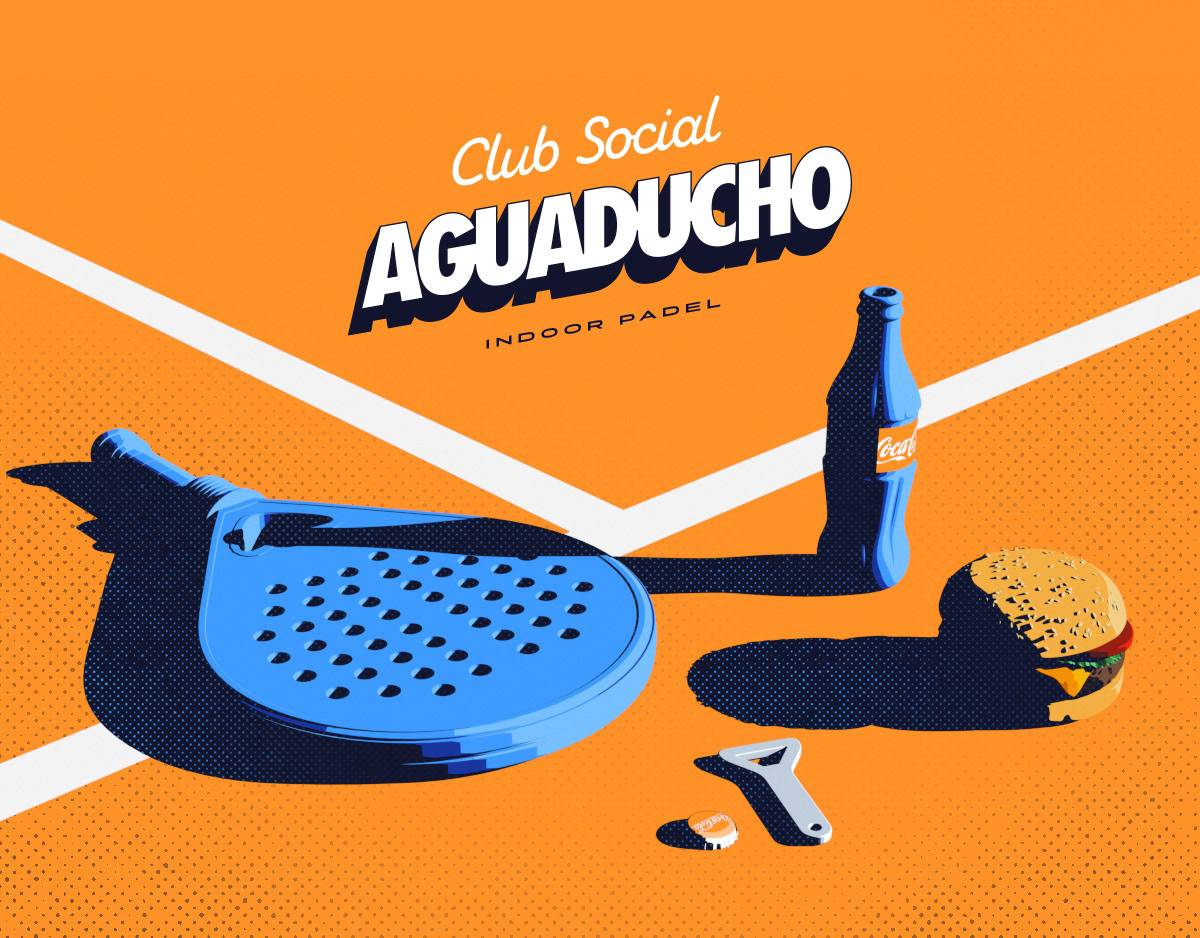
Club Social Aguaducho • BRANDING
Esto es Club Social Aguaducho, un lugar que se puede disfrutar jugando al pádel, comiendo algo rico en el bar, o hasta mirándolo por una pantalla como estás haciendo vos en este momento.
Para este proyecto trabajamos el naming, la conceptualización, tono de marca y la identidad.
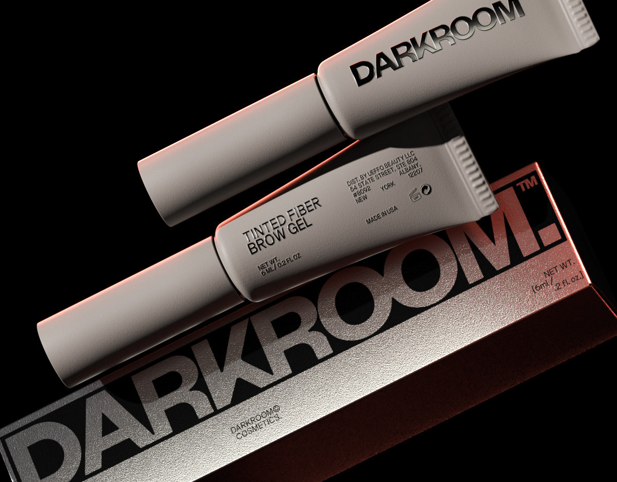
DARKROOM COSMETICS
Darkroom is a men's cosmetics brand that breaks the mold in the beauty market, generally oriented toward a female audience.
We wanted to create an exciting story from the name, as well as something out of the ordinary in the industry, and we took on that challenge.
We created the whole branding of the brand, taking as a starting point the idea of putting in the light things that until now had only happened in the dark.
We generated a concept that proposed that make-up should not "cover-up" or "hide" certain features of our face but rather highlight them.
From there, and considering the brand's name, we proposed "coming out into the light" and showing the best version of ourselves at all times and in all places.
This decision was translated into the brand's narrative and served as the starting point for developing the entire graphic universe.
Darkroom comes not only to enhance men's physical features but also to highlight their personalities.
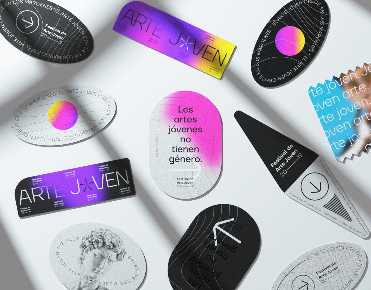
FESTIVAL DE ARTE JOVEN 20/19
El Festival de Arte Joven, es una experiencia que combina exposiciones de arte contemporáneo, música y espectáculos al aire libre. En 2019, desarrollamos la identidad de su primera edición. El proyecto nació bajo un concepto claro: poner en el centro de la escena, a todas esas expresiones que nacen en los márgenes, para darles notoriedad en un mismo festival. Un trabajo que, desde su génesis, nació para darle vida al arte.
LOGOS & MARKS Y/23
LA LIBERTAD (TNC) & BACILE STUDIO LOGOS & MARKS [2023]
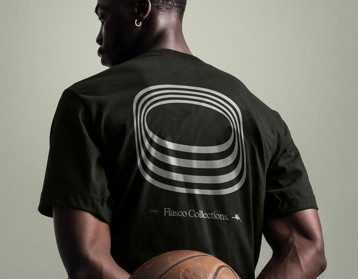
FIASCO©
FIASCO© is a designer clothing brand, reborn from the ashes of branding projects, rejected by different clients.
It is the reincarnation of many brands that did not see the light of day, in one that did. They are unique, unrepeatable and artistic t-shirt…
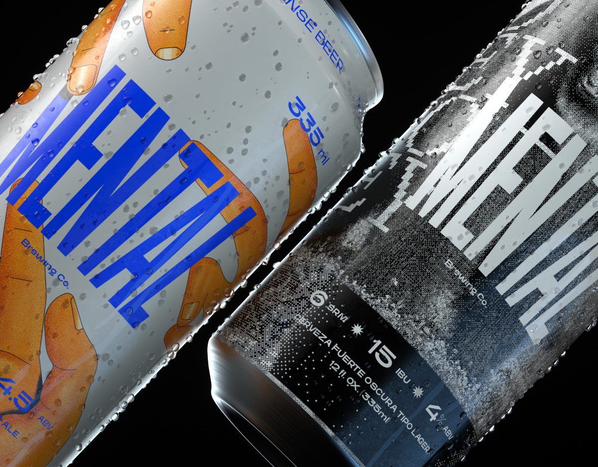
MENTAL BEER · Branding
MENTAL BREWING CO. es una cerveza a la que no le importa la tradición.
Sus variedades son accidentales, no están inscriptas en el linaje cervecero de ningún país ni en ningún legado familiar.
Si Mental representa a alguien, es justamente a esta generación.
Frente a lo clásico y lo establecido prefiere el remix de sabores, el zapping de estilos.
Mental es una birra que apuesta por combinaciones increíbles.
Quiere mezclar lo que nunca antes se probó.
Allí donde alguien dice “eso no tiene sentido”, es la invitación a probar a ver qué pasa.
LOGOS & MARKS Y/22
LA LIBERTAD TNC & BACILE STUDIO
LOGOS & MARKS [2022]
SWVL, TOKEN CARS, KNITTED CITY, SERRA, LOVELY PRODUCTIONS, SUPERFILIATE, LUV&LIFE, GO GLOBAL, LA MARY, DJUCE, URBO, MANSALVA, FIASCO, UNBOX, CREDO, MISIONES, BA:NU, MERCADO SAN ANTONIO, MEMBAH.