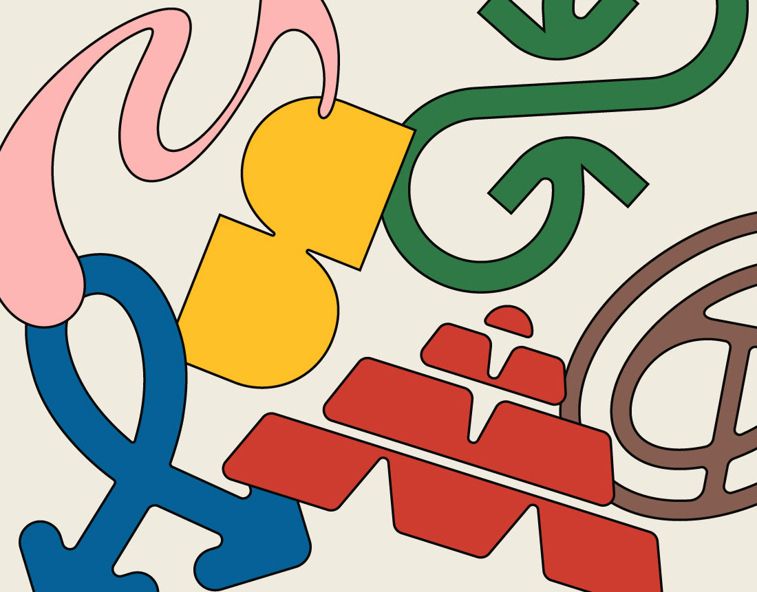
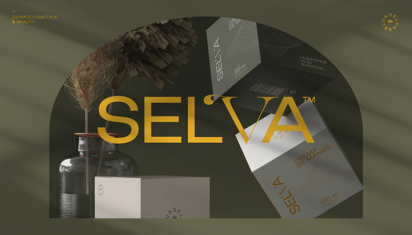
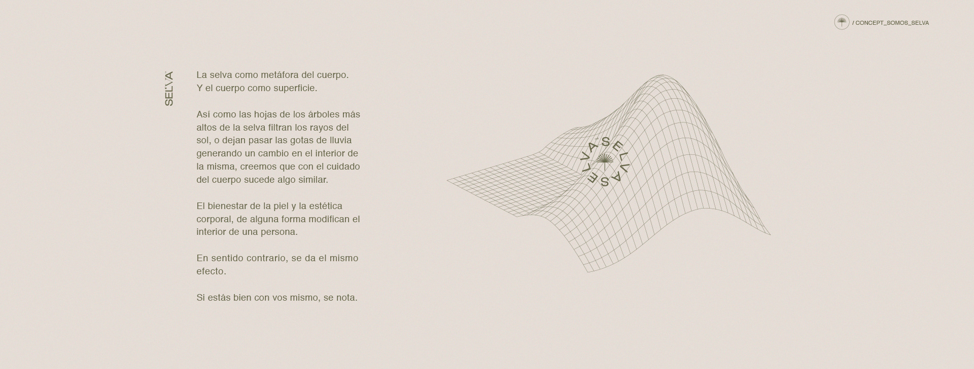
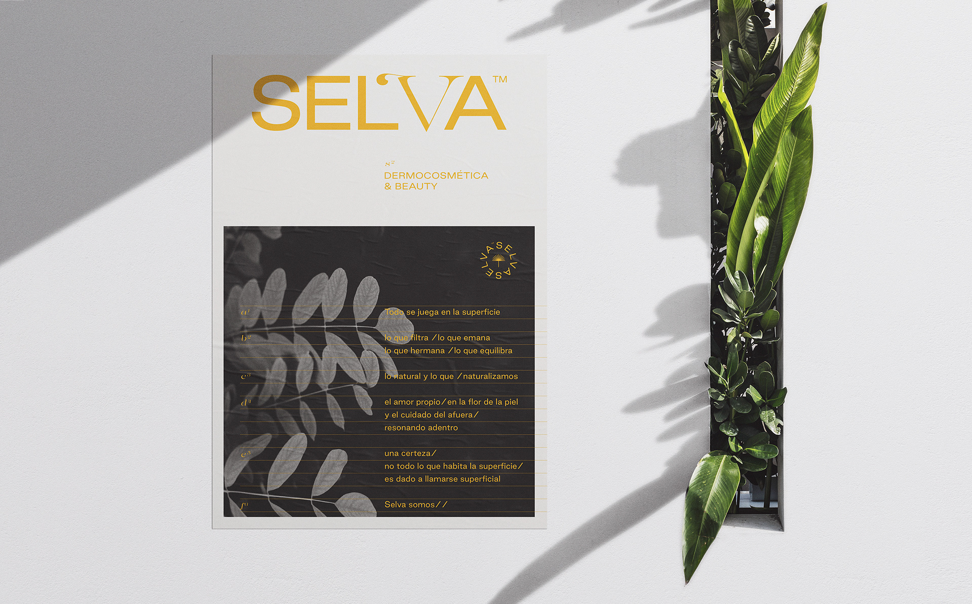
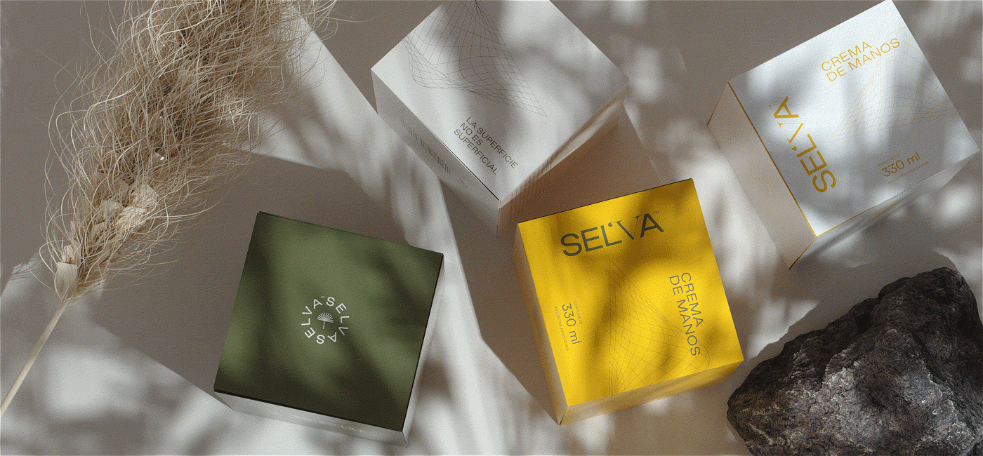
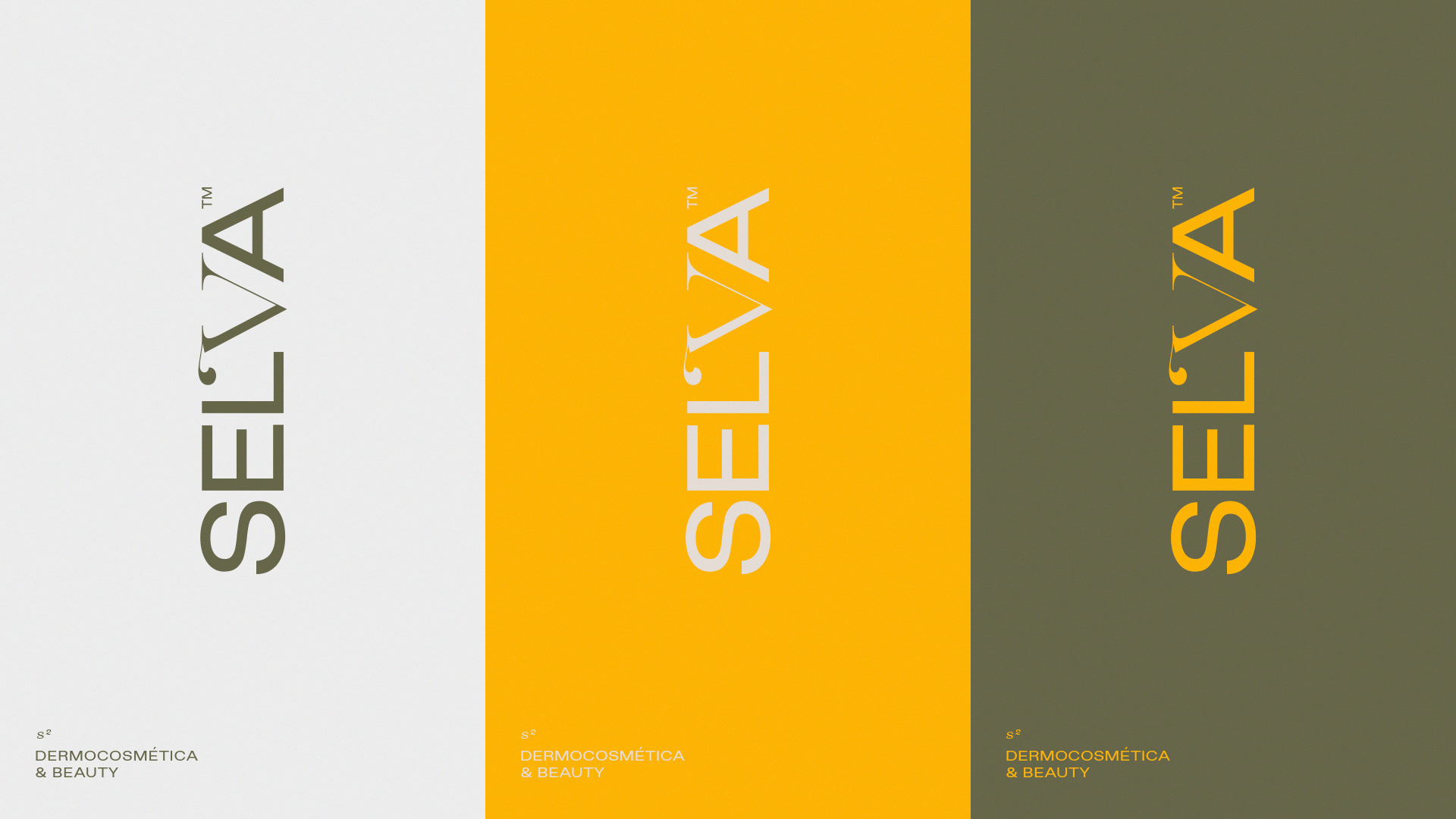
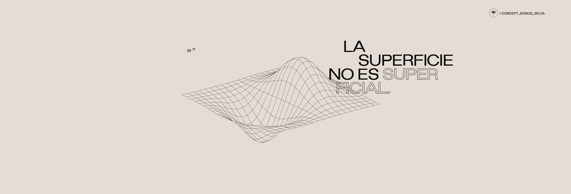
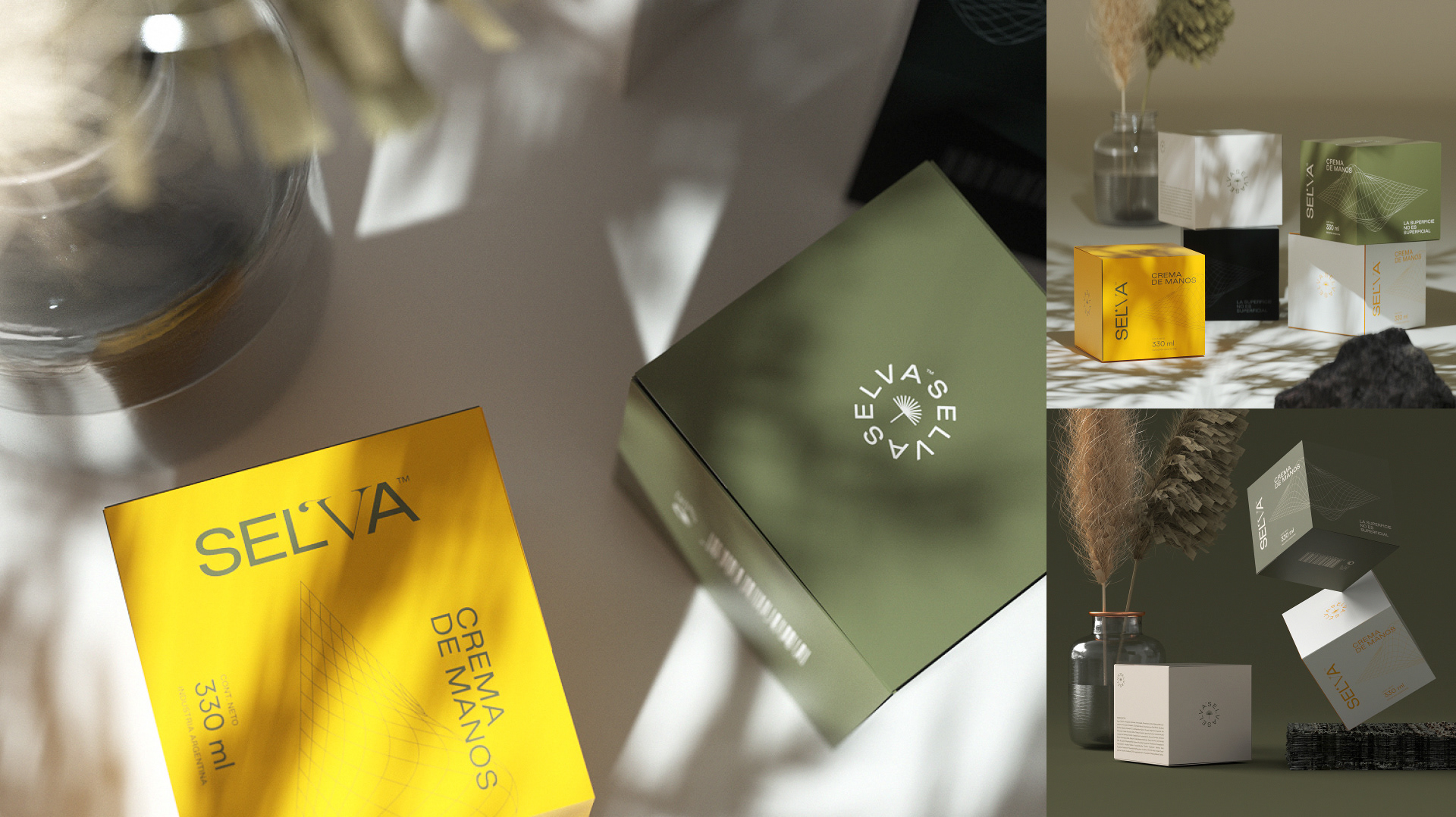
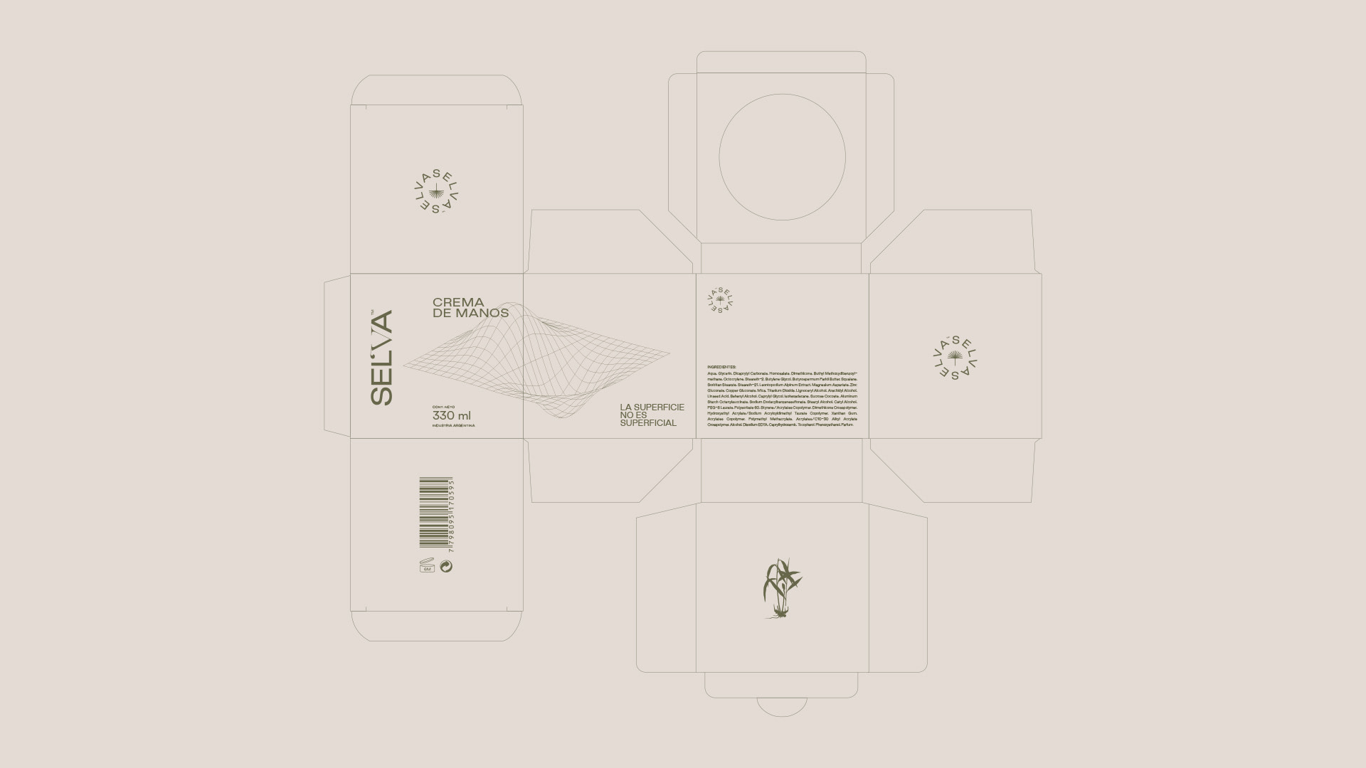
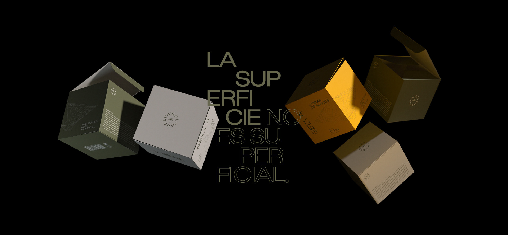
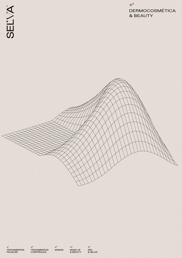
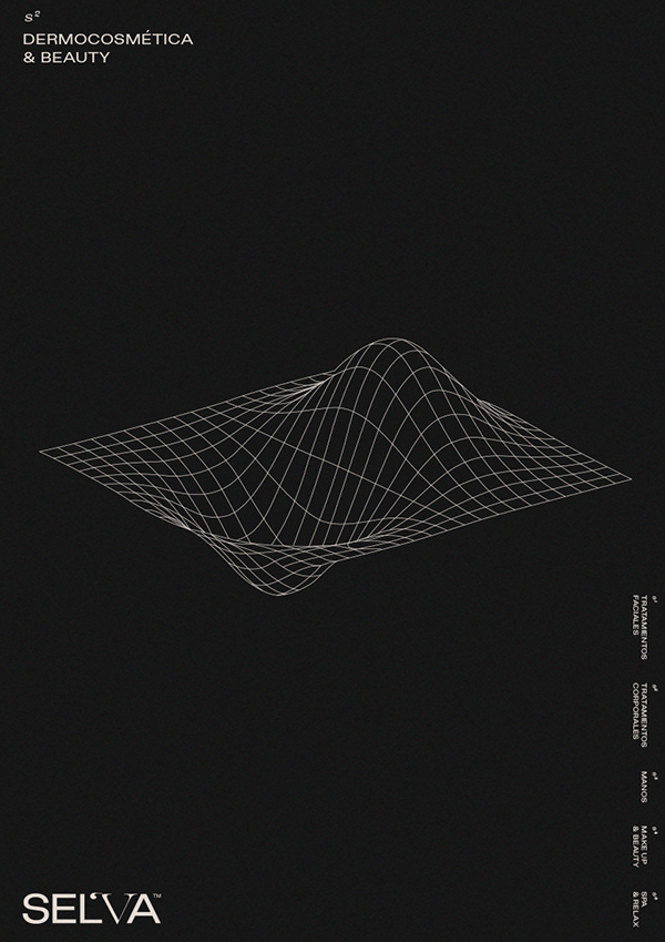
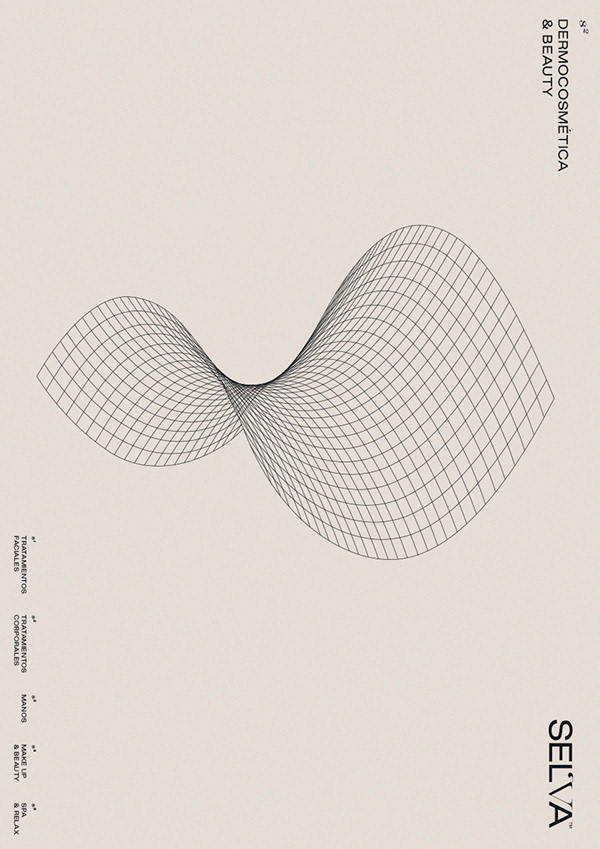
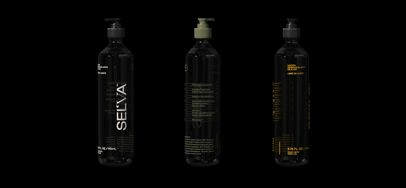
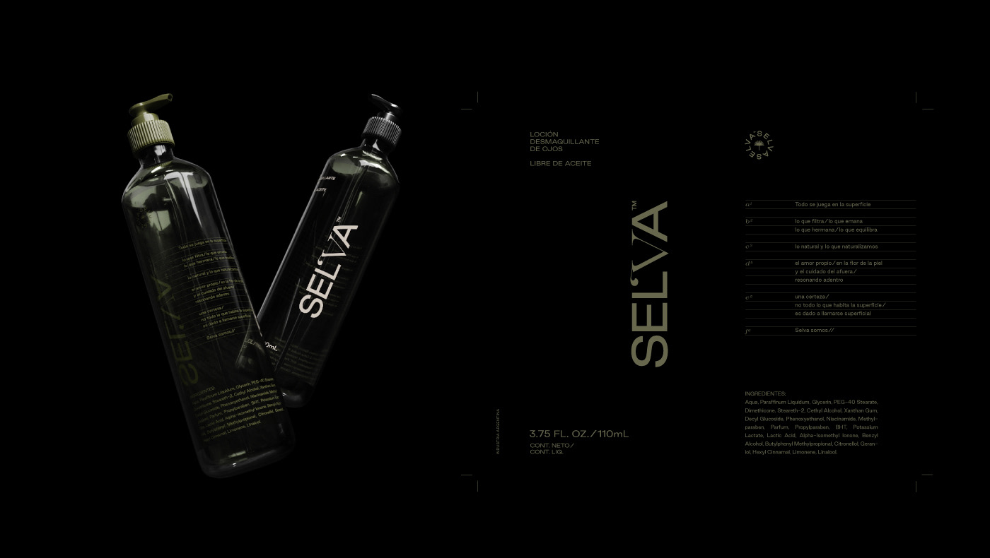
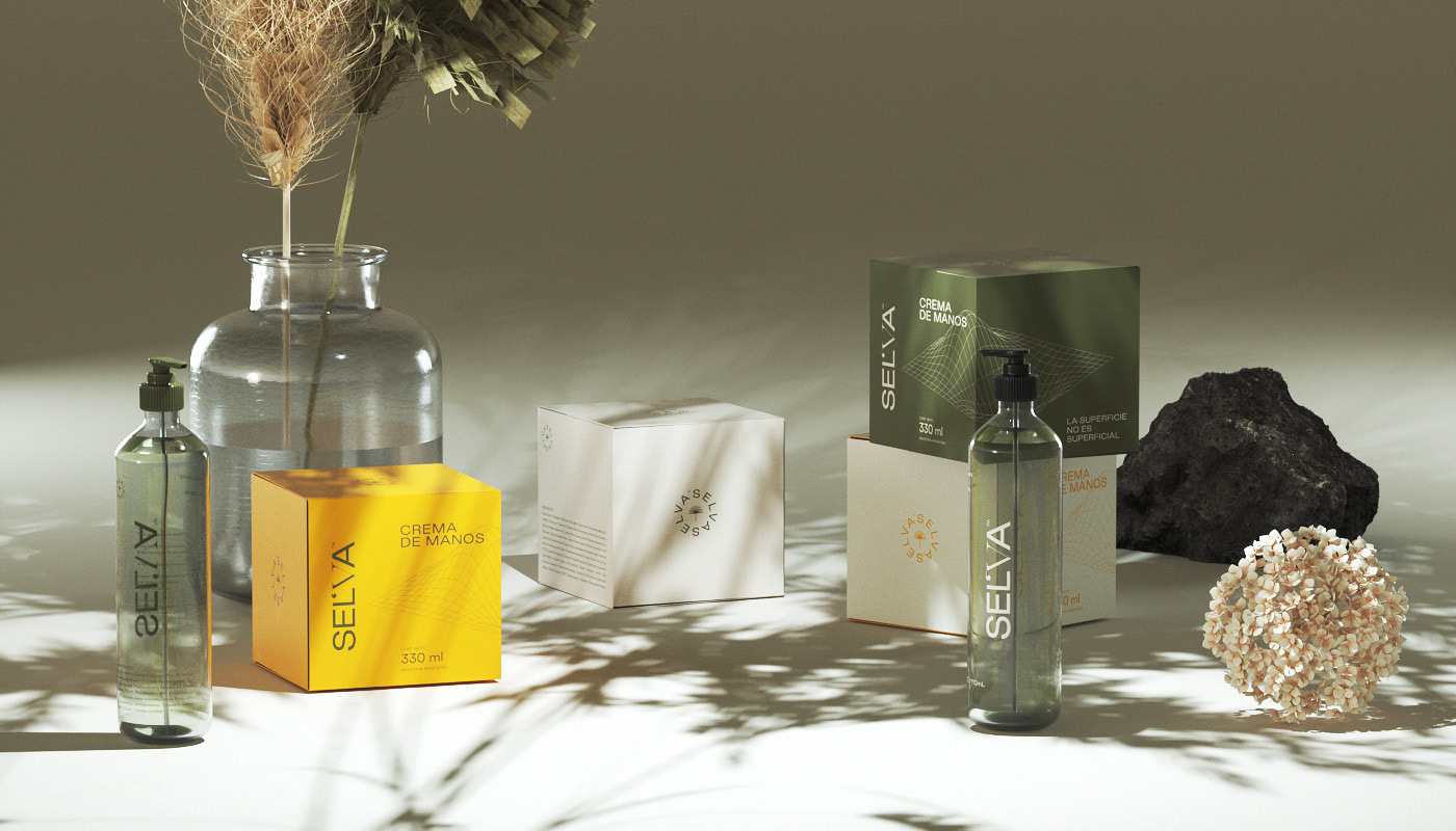
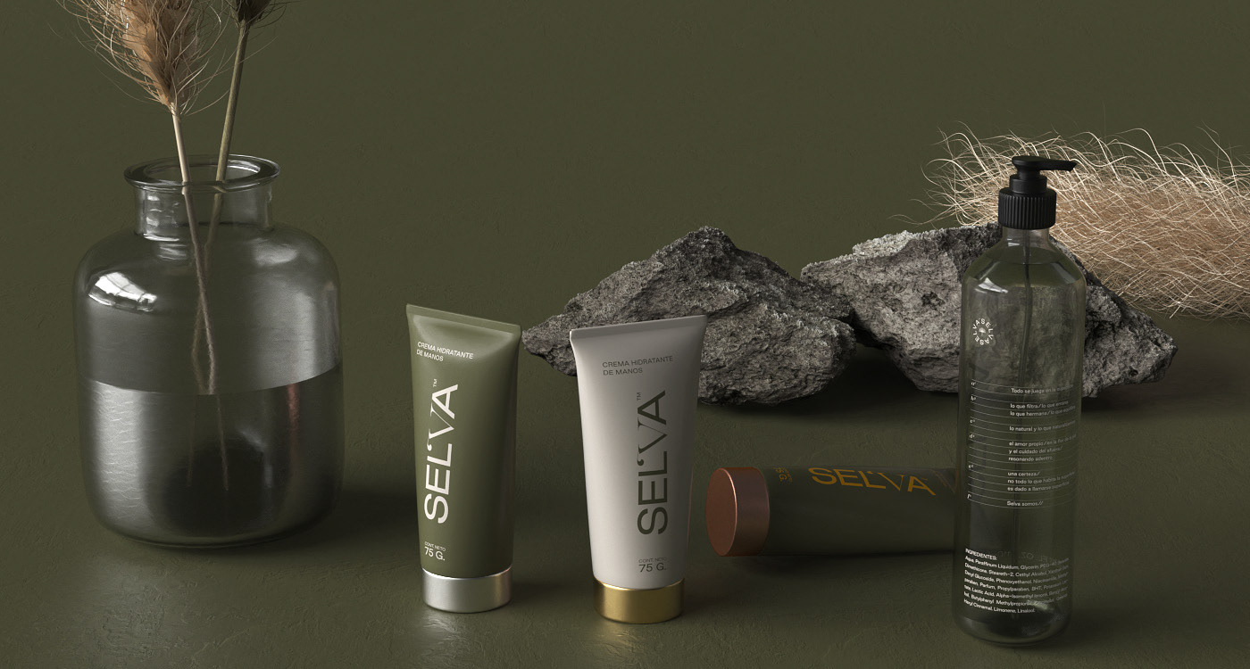
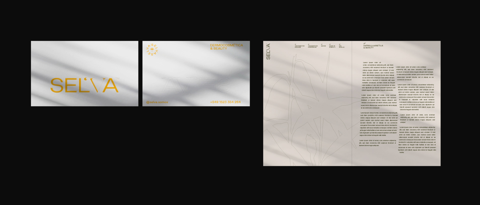
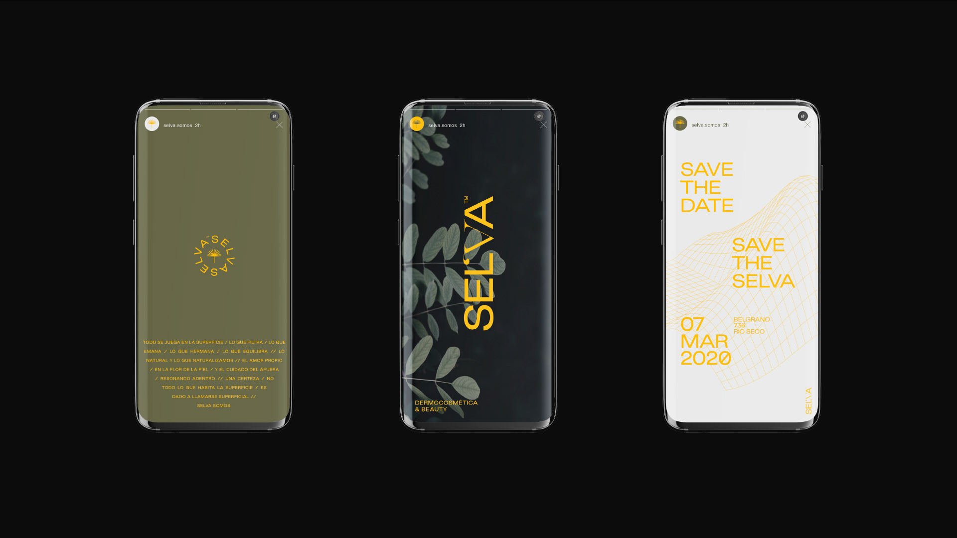
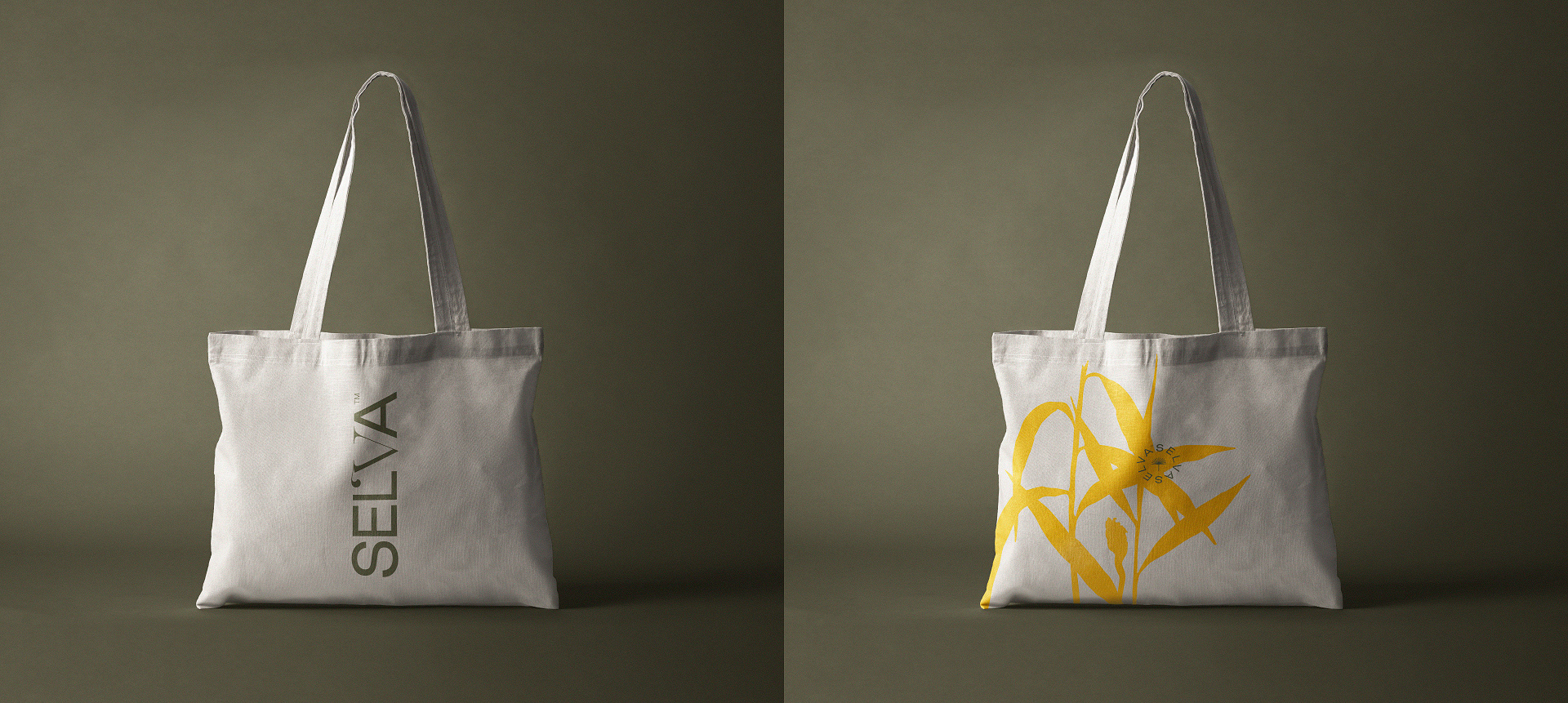
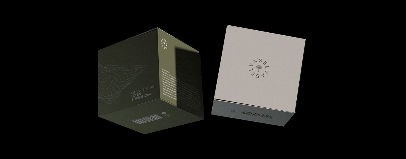
Otros proyectos

LOGOS & MARKS Y/22
LA LIBERTAD TNC & BACILE STUDIO LOGOS & MARKS [2022] SWVL, TOKEN CARS, KNITTED CITY, SERRA, LOVELY PRODUCTIONS, SUPERFILIATE, LUV&LIFE, GO GLOBAL, LA MARY, DJUCE, URBO, MANSALVA, FIASCO, UNBOX, CREDO, MISIONES, BA:NU, MERCADO SAN ANTONIO, MEMBAH.
SUPERFILIATE
Superfiliate is a brand that creates personalized shopping experiences that empower customers and creators to share their brand's stories online. This project consisted of developing the whole branding. The starting point for the brand's concept and aesthetics was the idea of making Superfiliate warmer and more friendly, transforming their customers into fans and their cold and transactional digital experiences into memorable and funny ones. The work included the visual identity, as well as its communication concept, copywriting, social media, and website.
BACILE * PERSONAL BRANDING
Bacile is my surname as well as my personal brand name, for which I started the process of creating a visual identity in 2020. Long overdue, I thought my graphic image needed a more professional and consistent refresh, and the main concept appears as a representation of my own skillset: graphic design and animation combined to create compelling and hypnotic communication. The concept responds to the visuals in their purest form. No fancy words, no long manifesto, no unbelievable promises. Just the graphics, open to the viewer's own conclusions.
INNATE CO.
The starting point for this project was to let go of artificial ingredients and embrace the benefits of natural ones. It sought to show that there is also science and accuracy in organic components. This is how Innate Co. is born. A brand that produces natural, science-based natural supplements, promoting a conscious and healthy lifestyle. We were asked to develop the visual identity and communication of the brand. We worked on the complete branding project, from its conceptualization to its visual development.
LOGOS & MARKS Y/23
LA LIBERTAD (TNC) & BACILE STUDIO LOGOS & MARKS [2023]
DARKROOM COSMETICS
Darkroom is a men's cosmetics brand that breaks the mold in the beauty market, generally oriented toward a female audience. We wanted to create an exciting story from the name, as well as something out of the ordinary in the industry, and we took on that challenge. We created the whole branding of the brand, taking as a starting point the idea of putting in the light things that until now had only happened in the dark. We generated a concept that proposed that make-up should not "cover-up" or "hide" certain features of our face but rather highlight them. From there, and considering the brand's name, we proposed "coming out into the light" and showing the best version of ourselves at all times and in all places. This decision was translated into the brand's narrative and served as the starting point for developing the entire graphic universe. Darkroom comes not only to enhance men's physical features but also to highlight their personalities.
Arquido • Branding
Arquido es una comunidad educativa de arquitectura, que busca democratizar conocimientos, generando una apertura total de contenidos e ideas, para darle la posibilidad a la gente, de acceder a información pertinente y a herramientas útiles, con el fin de realizar anteproyectos y visualizaciones arquitectónicas de calidad. El proyecto consistió en el rediseño de la identidad visual y la conceptualización de la marca.
LOGOFOLIO 2018/2020
LA LIBERTAD TNC & BACILE LOGOFOLIO 2018/2020: Selva, Tundra, AlquiloParticular, Peita, Grand Tour Catalunya, De La Rosa Tulum, Cow Co., Arquido, Run Altas Cumbres, Festival de Arte Joven, Reversible Estudio, 25 Watts, Bacile Studio, Aguaducho, Sincero, Lykke, Mental, Pangea.
BA:NU SKINCARE
Ba:nu is a beauty brand that focuses on falling in love with our skin. The brand narrative centers around the concept of pure love. And it proposes a sincere mutual care agreement between people and their bodies. This project consisted of developing the whole branding. The main idea behind the brand's concept and aesthetics was the softness and purity related to the skin and how each one takes care of it with love and tenderness. The work included the visual identity, as well as its communication concept, copywriting, social media, and packaging.
FUEGOS
Fuegos® de San Antonio es un pequeño restaurante ubicado en Villa Carlos Paz, especializado en alimentos autóctonos a la parrilla. Desde su concepción, buscamos destacar la importancia del fuego en la propuesta gráfica y conceptual de la marca, generando una historia visual y discursiva en torno a este elemento fundamental para este negocio. Trabajamos en todo el proceso de branding, desarrollando también la arquigrafía del lugar, la comunicación en redes sociales y piezas gráficas diversas como carteles, menú, neones, señalética, etc.