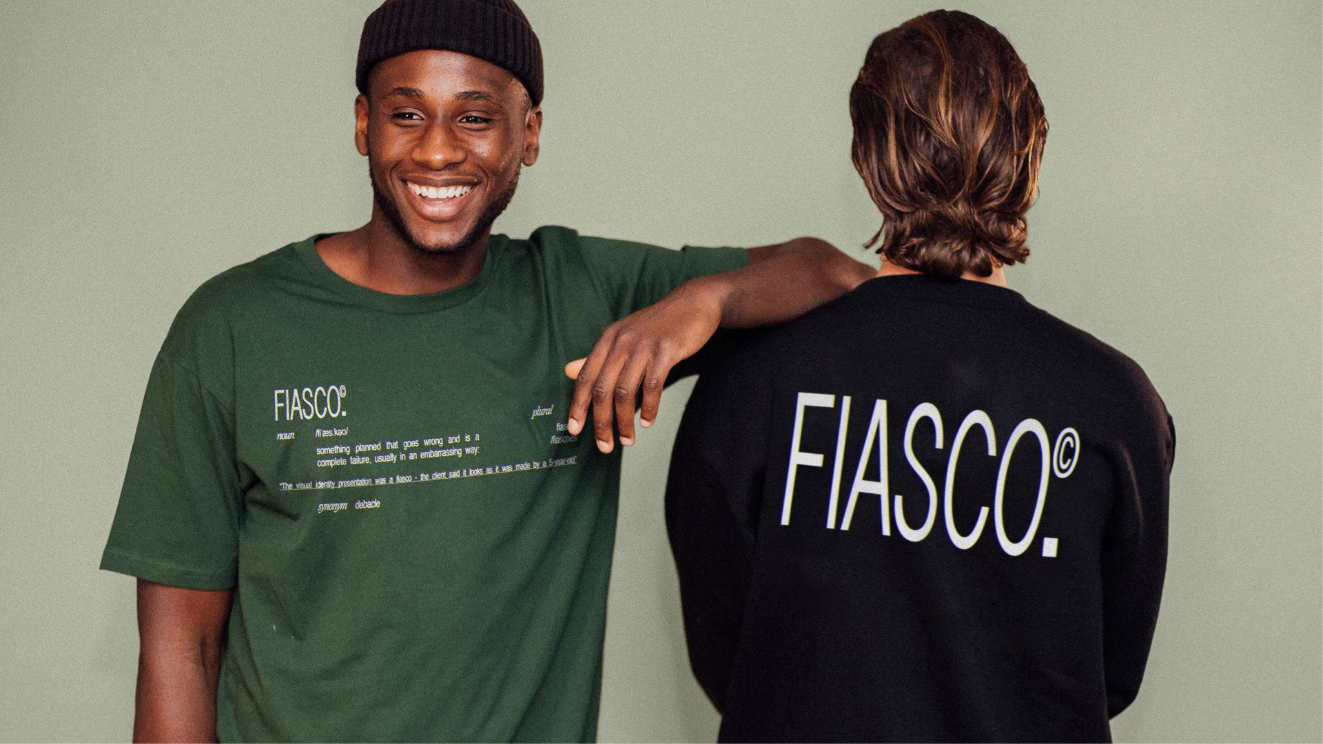
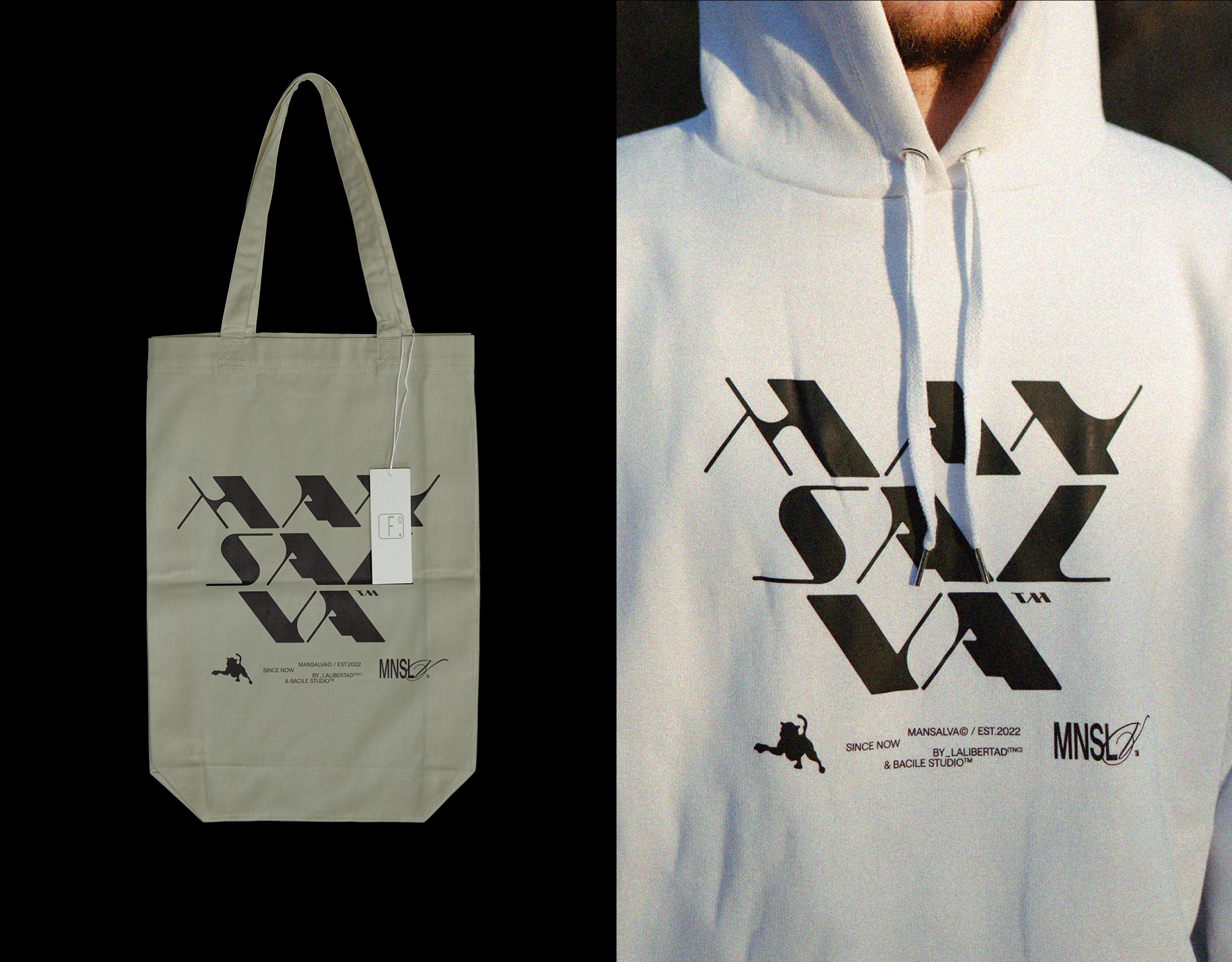
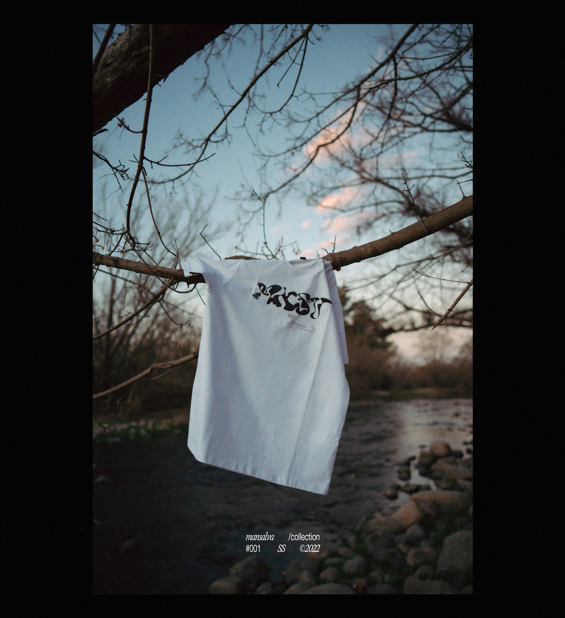
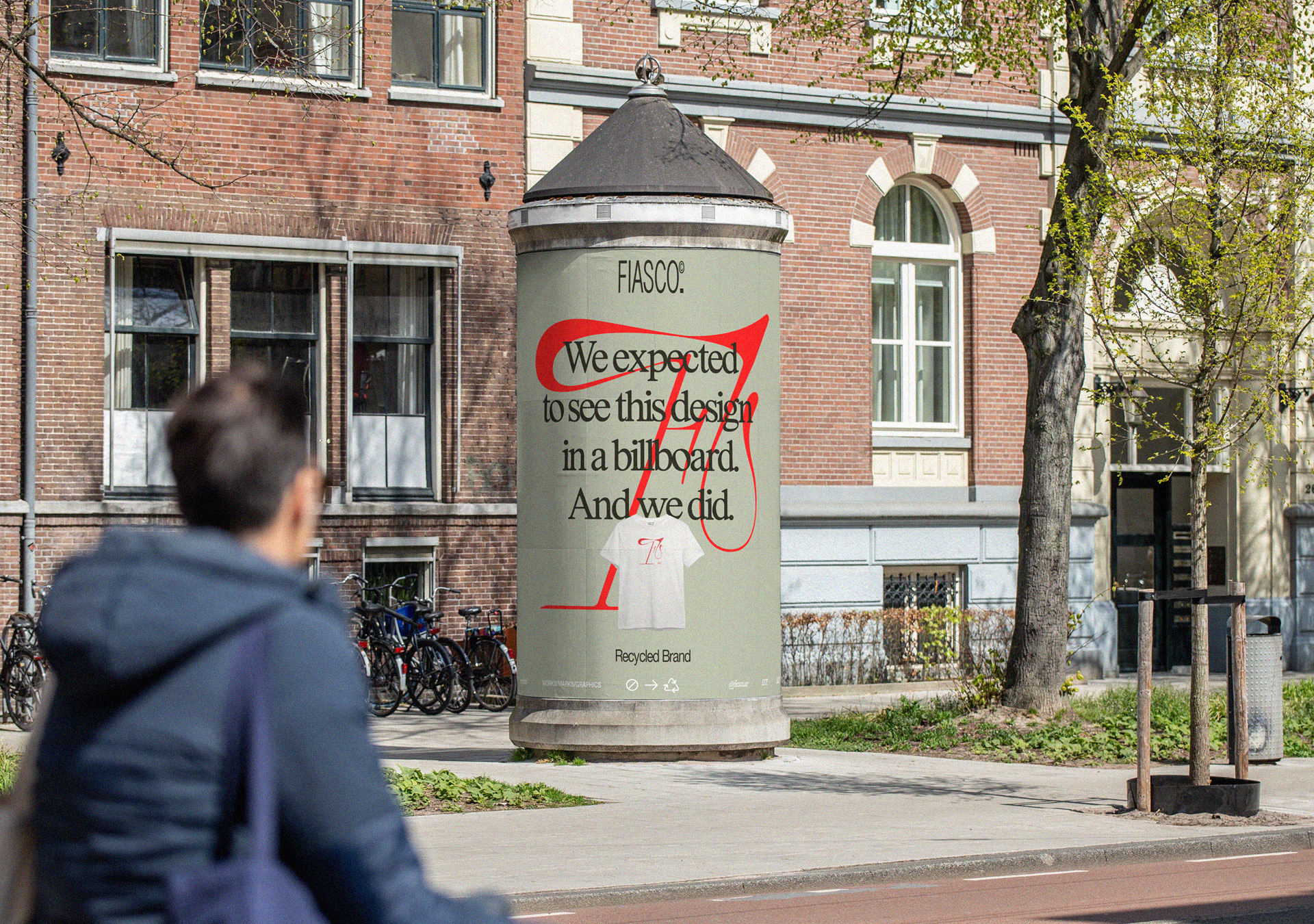
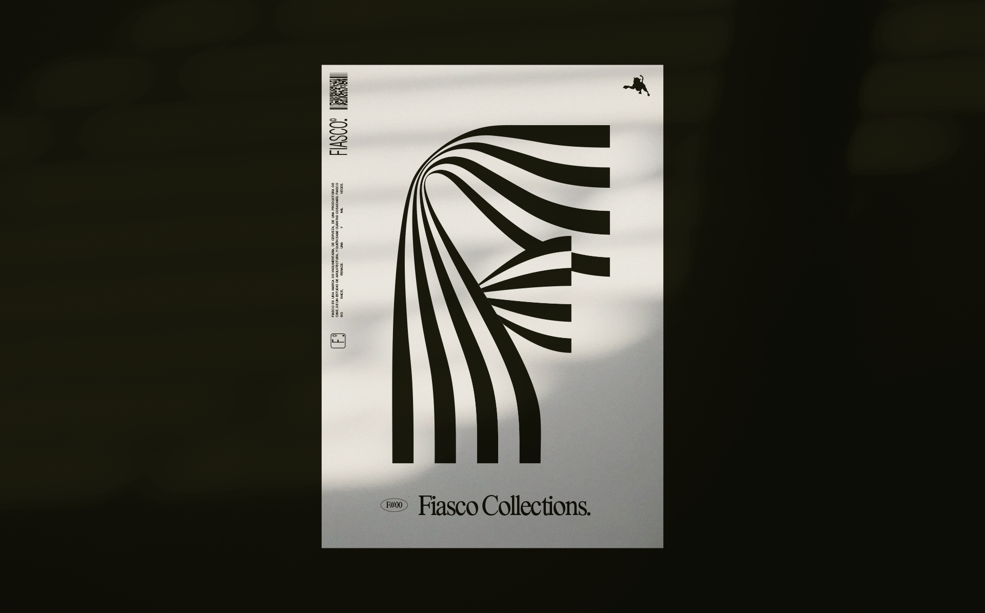
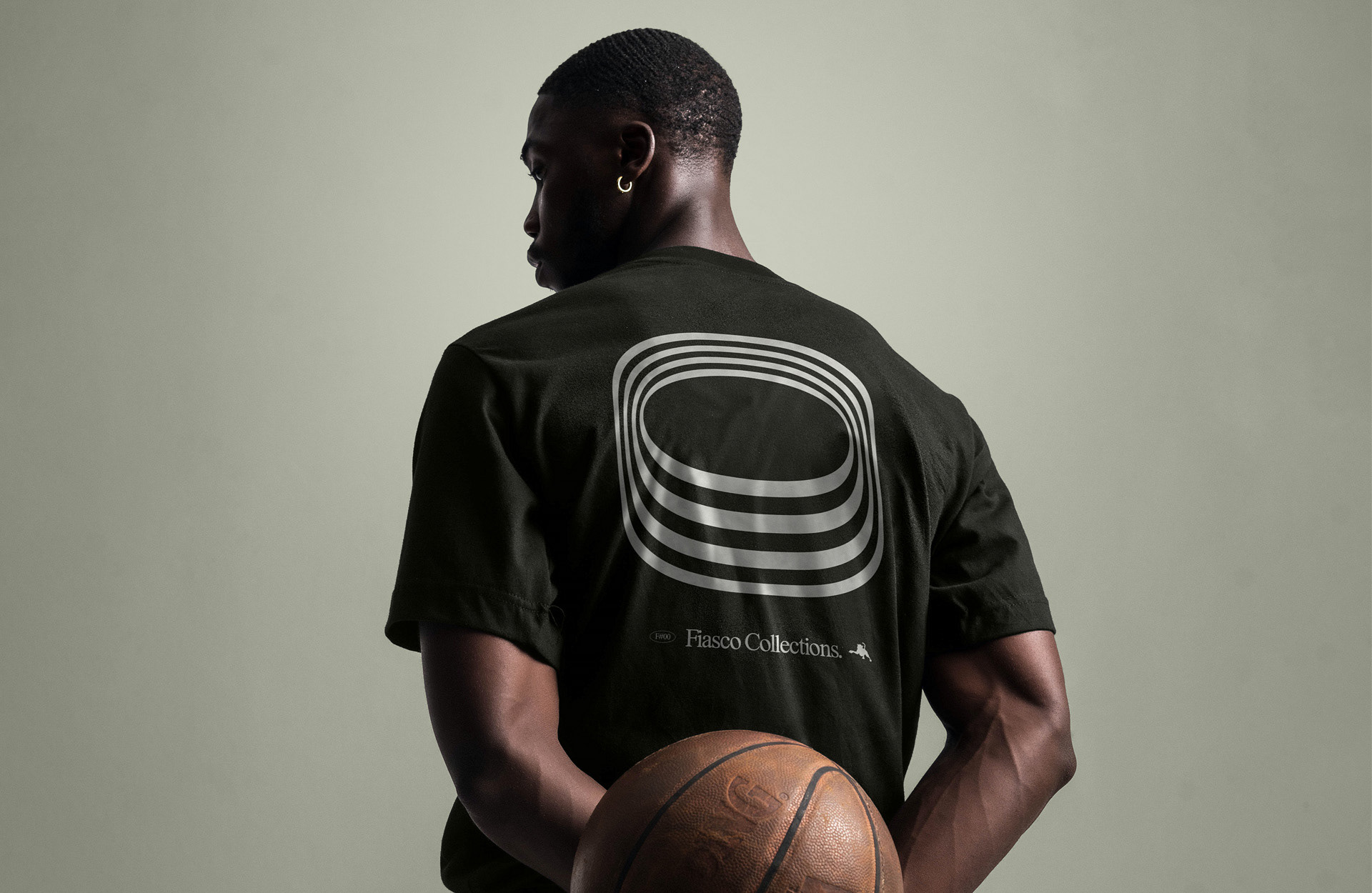
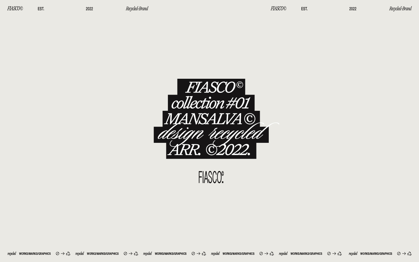
FIASCO© · MARCA RECICLADA · Y/2022


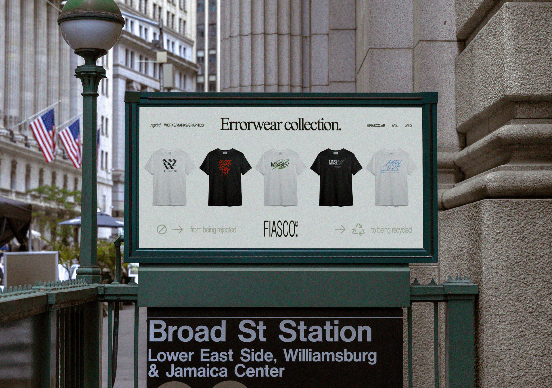
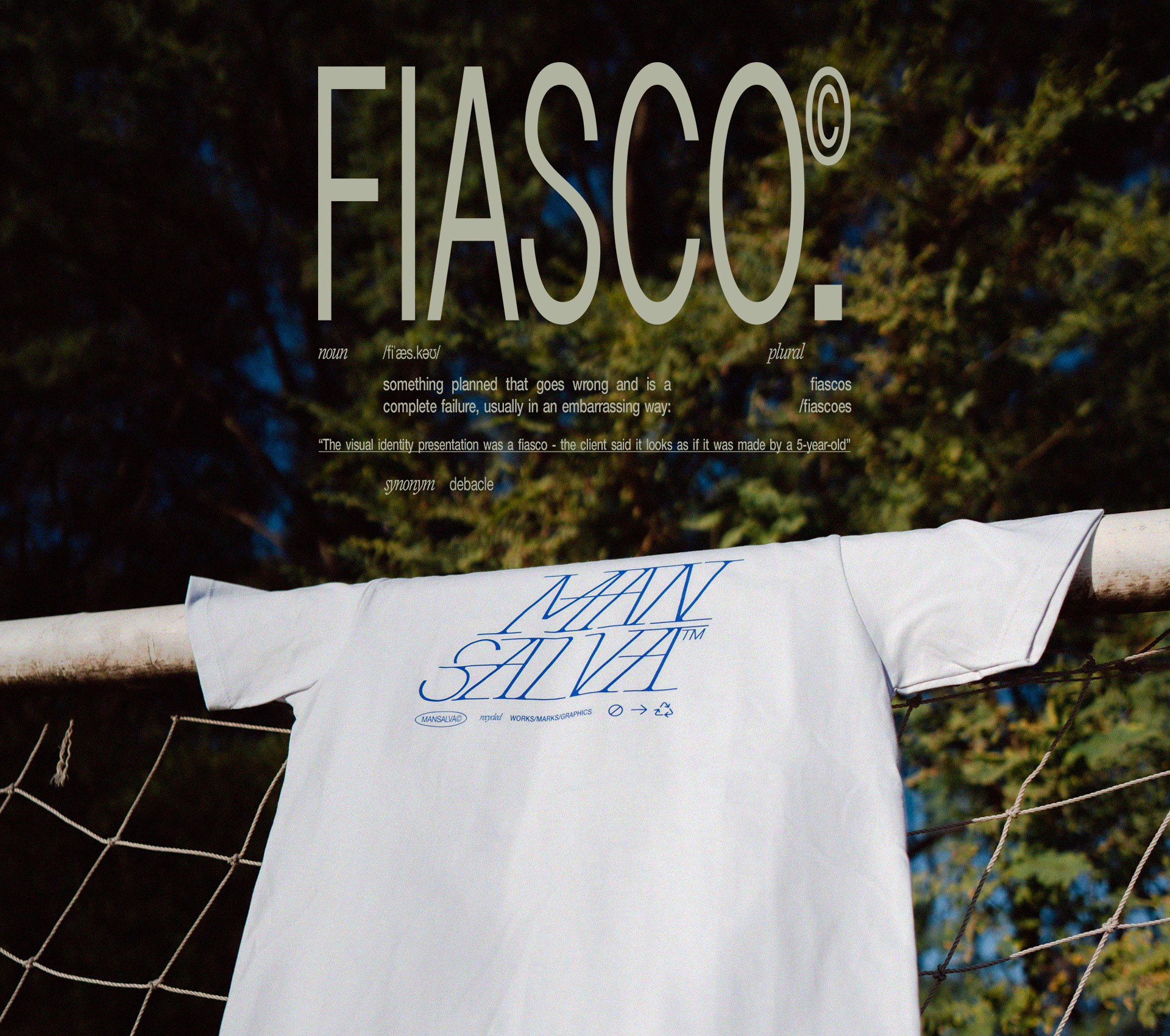
FIASCO is a design merch brand.
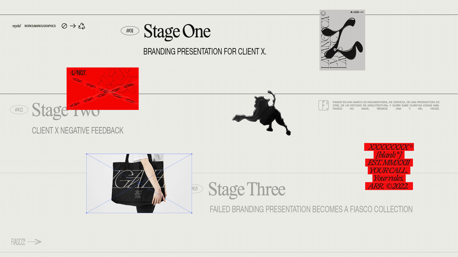
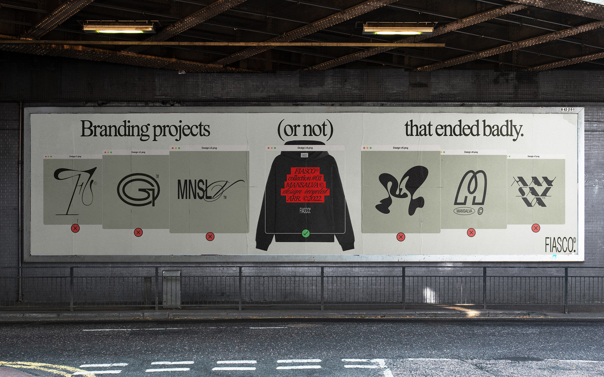
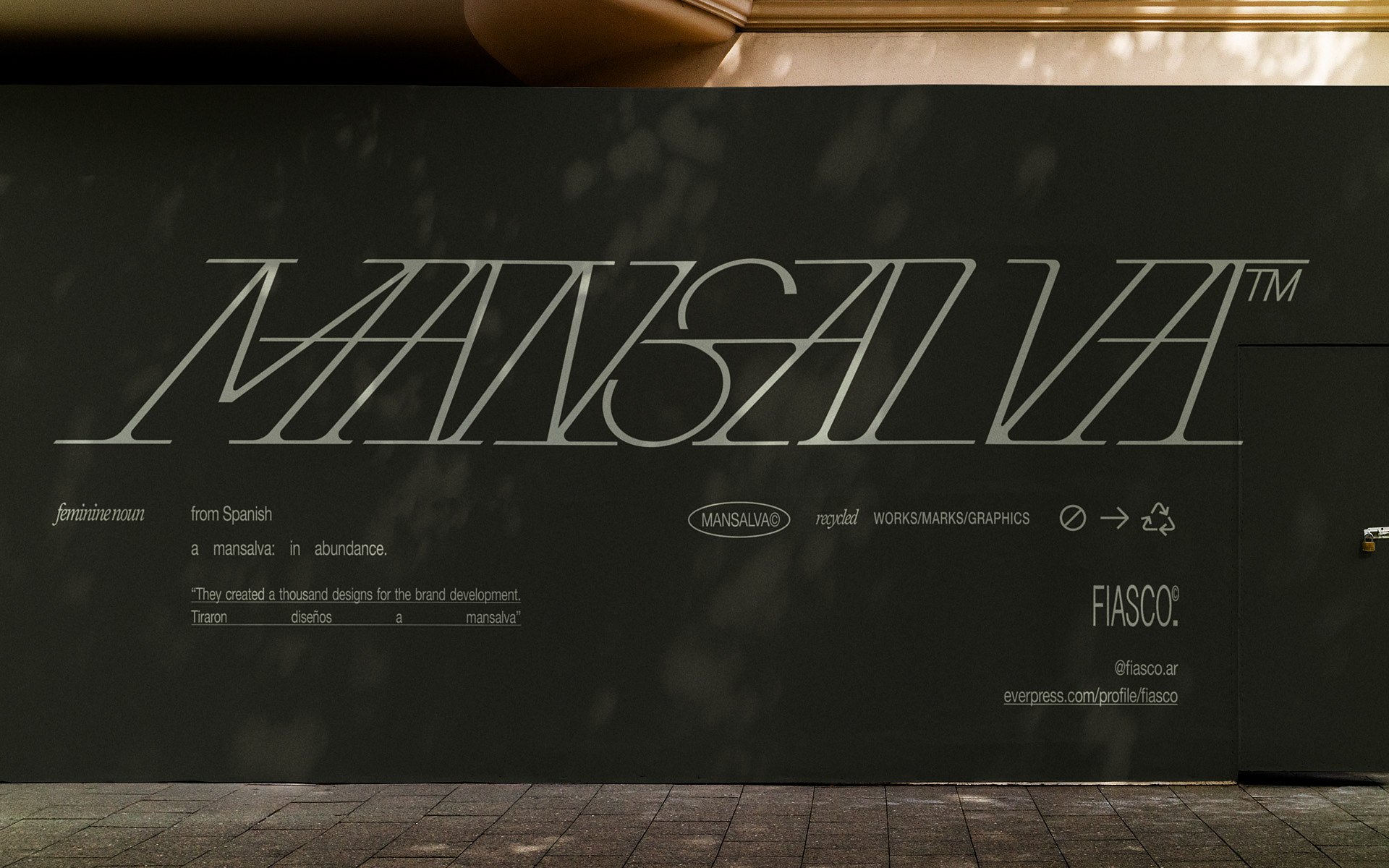
But, before that, it was a wine brand. An apparel brand, a beer brand, a movie production company, an architectural studio. And who knows how many more things.

FIASCO is not born. It's reborn.
Time after time.

From the ashes left by turned down projects.
A brand made stronger by failure, adopting what others rejected.

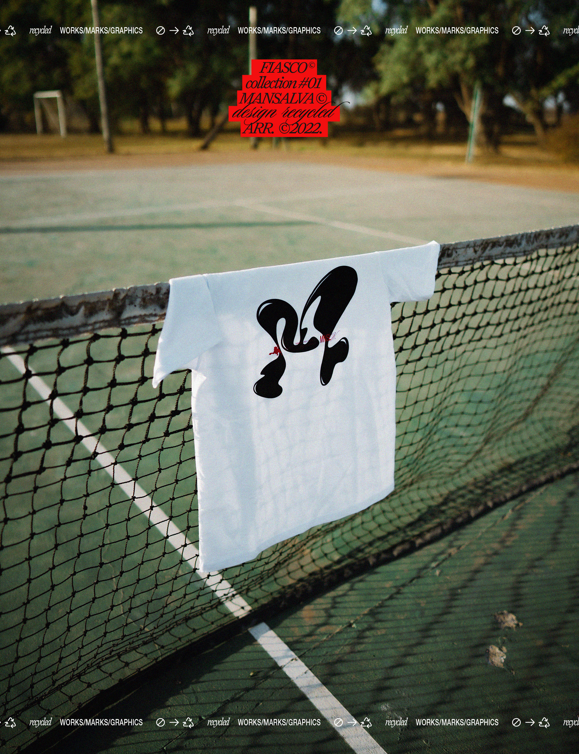
FIASCO is everything but succcess.
It's an extra life for everything we do day-to-day at the studio.


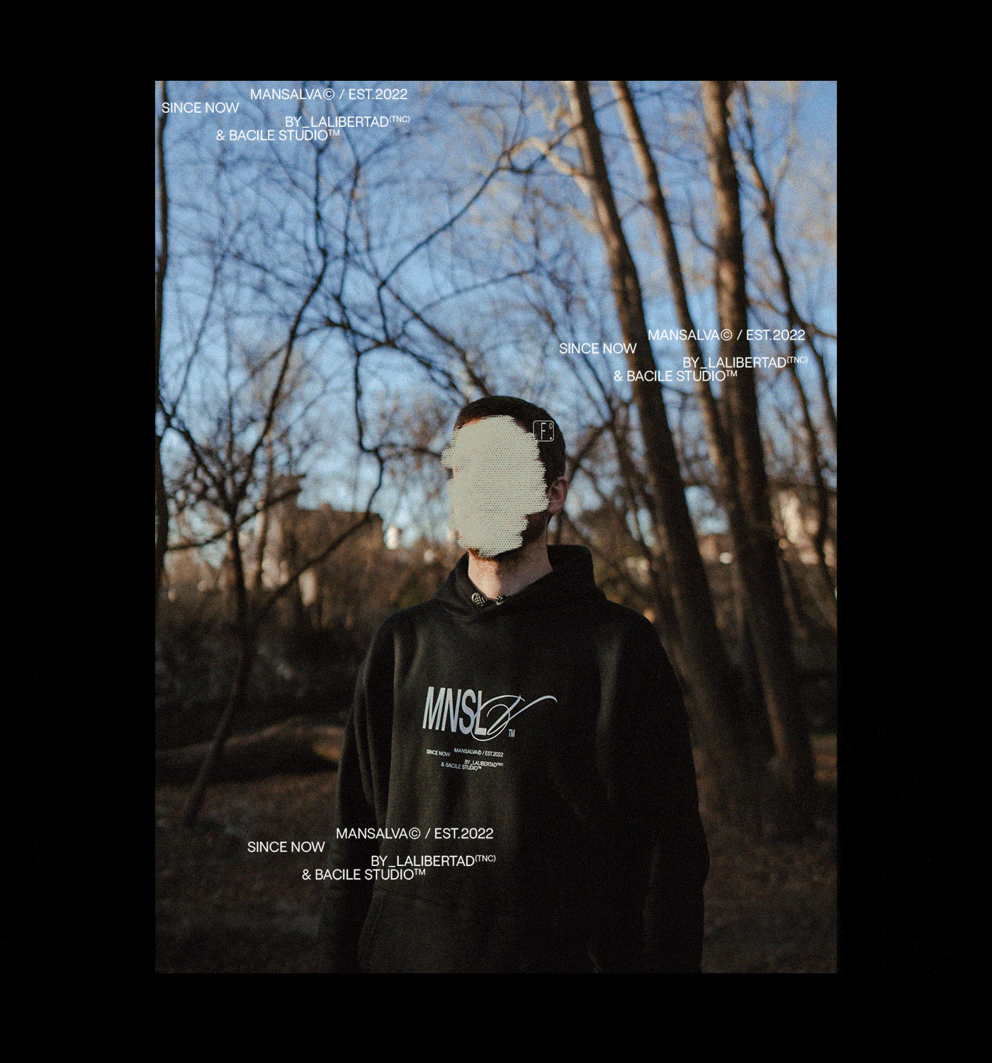
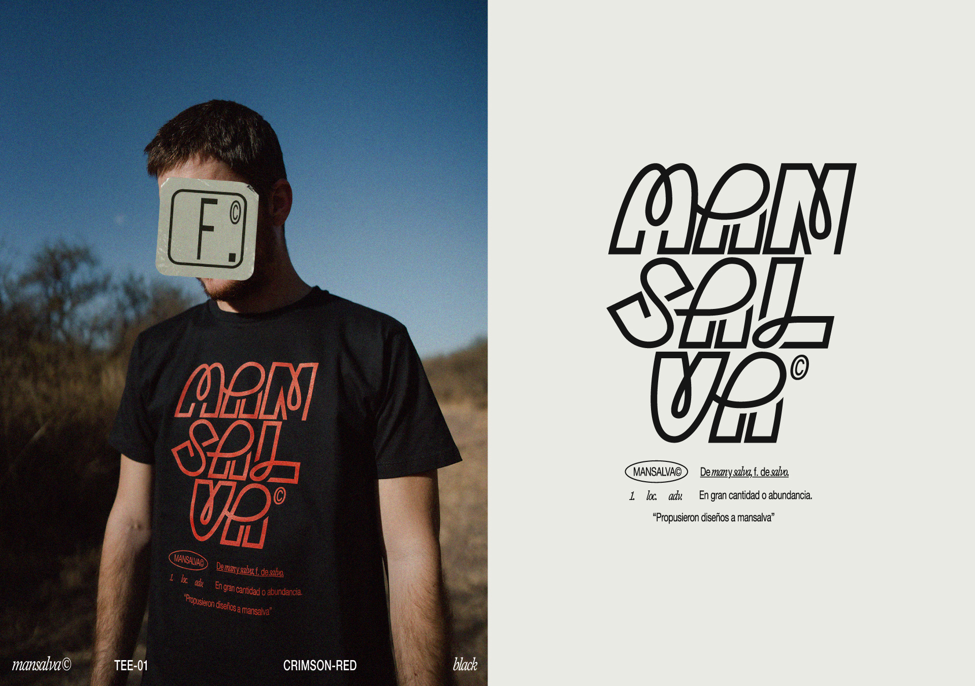
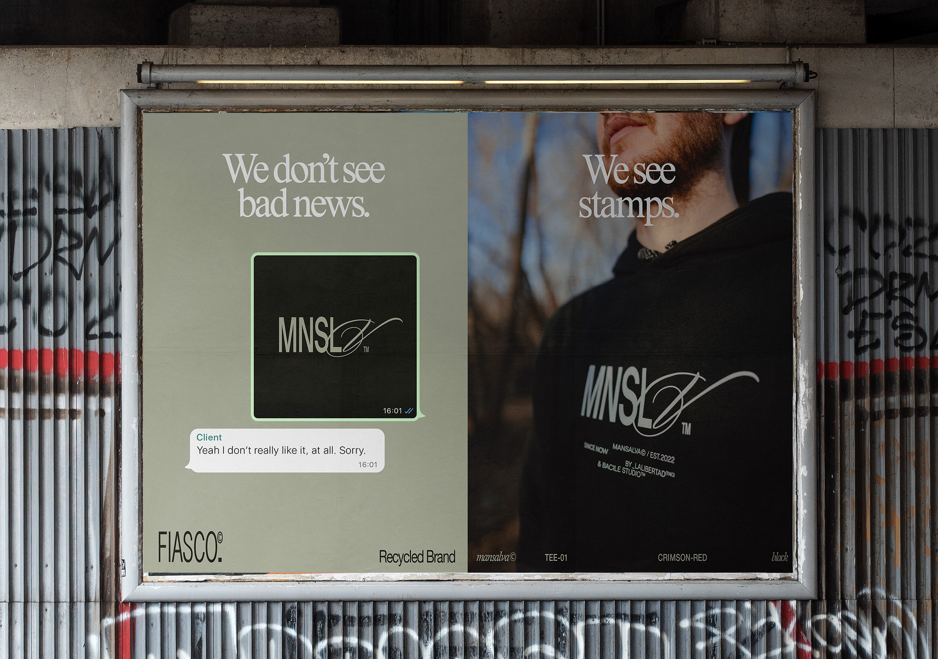
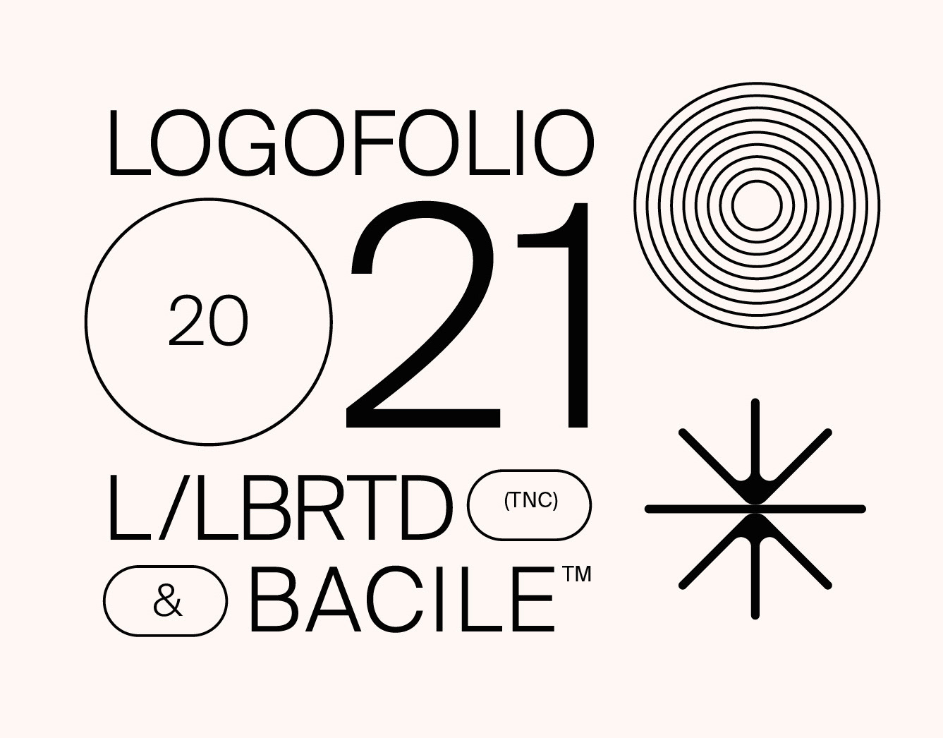
BACILE* & LA LIBERTAD TNC


> > > > >  SHOP ONLINE  < < < < <

BACILE* & La Libertad [TNC]    ·    Y/2022

@bacile_​​​​​​​

Otros proyectos

INNATE CO.
The starting point for this project was to let go of artificial ingredients and embrace the benefits of natural ones. It sought to show that there is also science and accuracy in organic components. This is how Innate Co. is born. A brand that produces natural, science-based natural supplements, promoting a conscious and healthy lifestyle. We were asked to develop the visual identity and communication of the brand. We worked on the complete branding project, from its conceptualization to its visual development.
LOGOFOLIO/2021
LA LIBERTAD TNC & BACILE LOGOFOLIO [2021] Hito, Not Your Mona, Far Far, Manifiesto, Utopía Colors, Dit, Zür, Calandria Norte, Gratitud, A Mar, Calandria Mall, Casablanca, Filadd, Innate, Framex, CoAgro, Caseland, Mercado San Antonio, Misc.
KNITTED CITY™
Knitted City is an international CG Studio that offers CG stills, animation, interactive experiences & art direction services. And this project consisted of developing the branding for the studio. The starting point for the brand's concept and aesthetics, was the idea of Knitted City as an open and great place to work. It’s related to the brand’s name, which tells the story of a united community of people from all over the world. We tried to represent the idea of a great ecosystem of work that attracts talents worldwide. The work included the visual identity, as well as its communication concept, copywriting, social media and website.
LOGOFOLIO 2018/2020
LA LIBERTAD TNC & BACILE LOGOFOLIO 2018/2020: Selva, Tundra, AlquiloParticular, Peita, Grand Tour Catalunya, De La Rosa Tulum, Cow Co., Arquido, Run Altas Cumbres, Festival de Arte Joven, Reversible Estudio, 25 Watts, Bacile Studio, Aguaducho, Sincero, Lykke, Mental, Pangea.
Club Social Aguaducho • BRANDING
Esto es Club Social Aguaducho, un lugar que se puede disfrutar jugando al pádel, comiendo algo rico en el bar, o hasta mirándolo por una pantalla como estás haciendo vos en este momento. Para este proyecto trabajamos el naming, la conceptualización, tono de marca y la identidad.
Arquido • Branding
Arquido es una comunidad educativa de arquitectura, que busca democratizar conocimientos, generando una apertura total de contenidos e ideas, para darle la posibilidad a la gente, de acceder a información pertinente y a herramientas útiles, con el fin de realizar anteproyectos y visualizaciones arquitectónicas de calidad. El proyecto consistió en el rediseño de la identidad visual y la conceptualización de la marca.
PANGEA · Branding
Pangea es una marca de indumentaria y billeteras ecológicas de Córdoba, Argentina. Que a través del concepto propuesto en este proyecto, no busca marcar diferencias, sino encontrar similitudes entre las personas del mundo. Unidas por sus gustos a la hora de vestir, por sus ideales, por sus creencias... El proyecto, consistió en la creación del concepto comunicacional para la marca, y en todo el desarrollo de branding.
BACILE * PERSONAL BRANDING
Bacile is my surname as well as my personal brand name, for which I started the process of creating a visual identity in 2020. Long overdue, I thought my graphic image needed a more professional and consistent refresh, and the main concept appears as a representation of my own skillset: graphic design and animation combined to create compelling and hypnotic communication. The concept responds to the visuals in their purest form. No fancy words, no long manifesto, no unbelievable promises. Just the graphics, open to the viewer's own conclusions.
FESTIVAL DE ARTE JOVEN 20/19
El Festival de Arte Joven, es una experiencia que combina exposiciones de arte contemporáneo, música y espectáculos al aire libre. En 2019, desarrollamos la identidad de su primera edición. El proyecto nació bajo un concepto claro: poner en el centro de la escena, a todas esas expresiones que nacen en los márgenes, para darles notoriedad en un mismo festival. Un trabajo que, desde su génesis, nació para darle vida al arte.
BA:NU SKINCARE
Ba:nu is a beauty brand that focuses on falling in love with our skin. The brand narrative centers around the concept of pure love. And it proposes a sincere mutual care agreement between people and their bodies. This project consisted of developing the whole branding. The main idea behind the brand's concept and aesthetics was the softness and purity related to the skin and how each one takes care of it with love and tenderness. The work included the visual identity, as well as its communication concept, copywriting, social media, and packaging.